
Choosing the right frame for your artwork is as important as finding the right piece of art. My background includes 5 years as a prefessional framer and 14 years experience working at the Seattle Art Museum in the Exhibition Design department. In this article, I’m going to impart my advice on the quality of materials you choose and on the creative element of your choice.
One question of often hear: Why does the frame cost more than the print? Quality framing materials are generally more expensive than a print, and a well-framed print can look as beautiful as an original.
-Shatter-restant and up to 99% of damaging UV rays blocked with Tru Vue Conservation Clear® Acrylic
-Artcare acid-free, double-thick matting
-Mounted with acid-free linen tape, backed with acid-free materials
The Frame
Since I’ve been selling my Limited Edition Prints, I’ve been asking clients to share images of their framing choices and it’s been really fun to see the varied results. Your frame choice should reflect your personal style and taste as well as compliment the artwork.
It can be intimidating to have lots of different choices, but try to have fun. At the bottom of the article, you’ll find several images clients have generously shared for inspiration.
Archival Materials for Lasting Quality
In a nutshell, this means three things: your glazing material, matting, and backing material.
When I was a framer, I saw firsthand how light could damage works on paper. I highly recommend using a glass or plexiglass with a UV coating. Even if you use a ready-made frame, a custom framer can cut a piece for you to switch out when putting it all together with minimal additional cost.
You’ll want your matting and your backing materials to be Acid-free. This even includes the tape used to mount the artwork. Non acid-ree materials off-gas and can burn the paper. In time, you’ll notice the paper of the artwork beginning to brown.
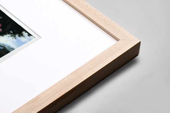
The Mat: Form and Function
The mat for a print serves two purposes: it can enhance the look of the artwork, and it protects the art.
The right mat helps draw the eye in and can add a bit of grandeur or drama to the overall presentation of your new artwork. In general, I recomend a mat between 2″ and 4″ wide. You usually don’t want the size of the frame and the mat to be the same, but I’ve seen plenty of examples of that working just fine. Another instance of trusting your instinct.
As for color, I’ve always preferred a simple “white” mat. I feel that a white mat really brings attention to the artwork without any distractions. The exception to this is your personal taste and decorating style. If your house is overall more bold and colorful, then adding a pop of color in your mating might fit right in. I say try the white first, but ultimately, go with your gut.
And when I say “white” I mean the white that matches the color of the paper best. If you’re having your Limited Edition Print custom framed, don’t be surprised to have your framer pull out dozens of white mats to choose from!
As to the protective element of matting, keeping space between the Limited Edition Print and the glass is the main goal of the mat. A mat allows air circulation in this space and helps prevent mildew, mold, and buckling. It also keeps artwork from sticking to the glazing material and becoming damaged.
Now it’s your turn!
Best of luck in your own picutre framing adventures! Feel free to reach out via the contact form here on my website, whether you have a question or something to share. I love to hear from my readers and collectors, and fellow art lovers. And I’d love to add your own framing choices to the gallery below.
Framed by Audrey 
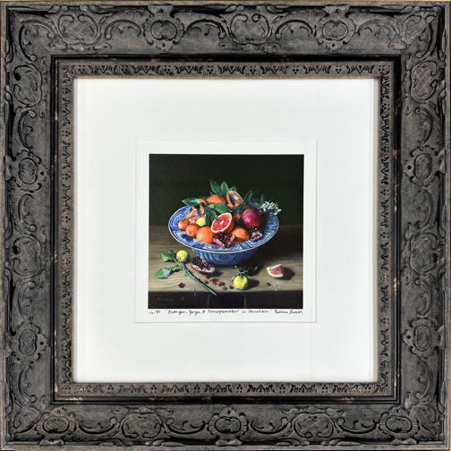
Framed by Rebecca 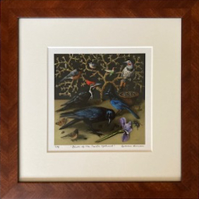
Framed by Mike 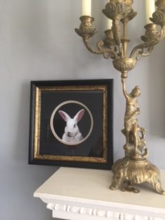
Framed by Nicky 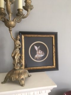
Framed by Nicky 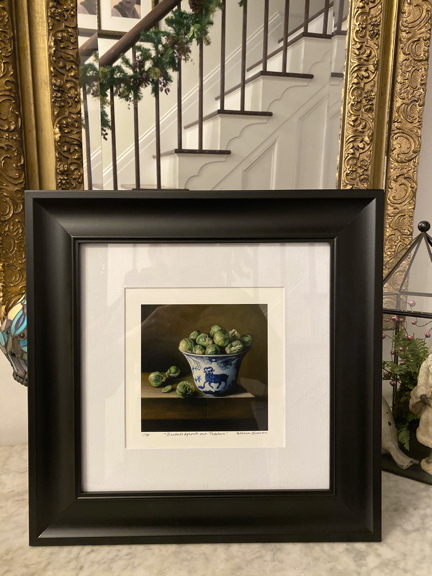
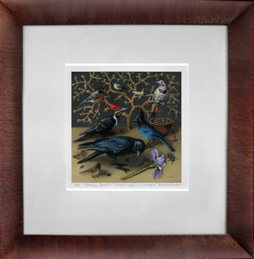
Framed by Theresa 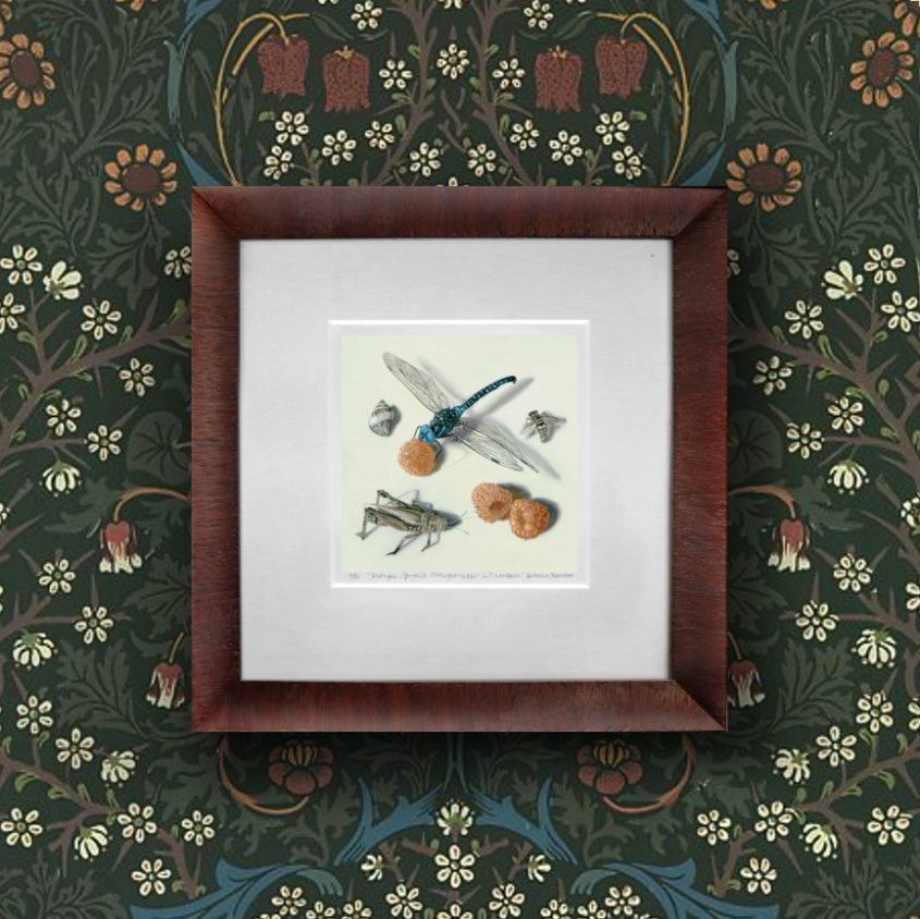
Framed by Rebecca 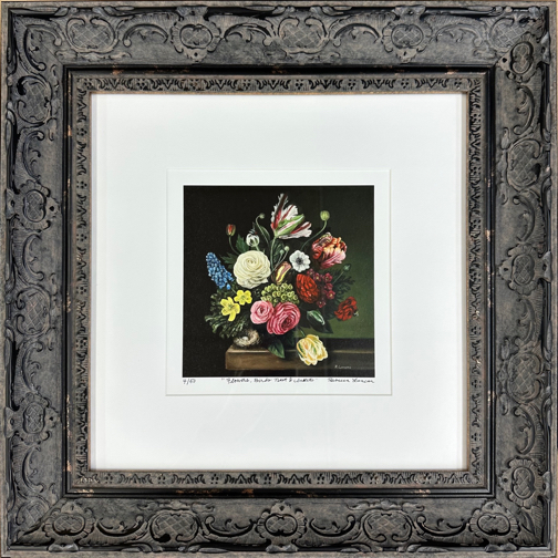
Framed by Audrey 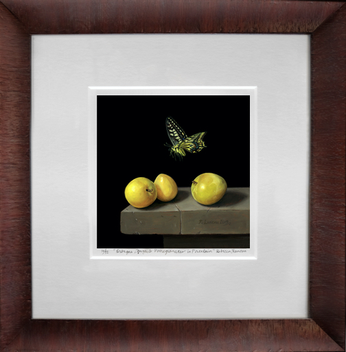
Framed by Rebecca 
Framed by Theresa 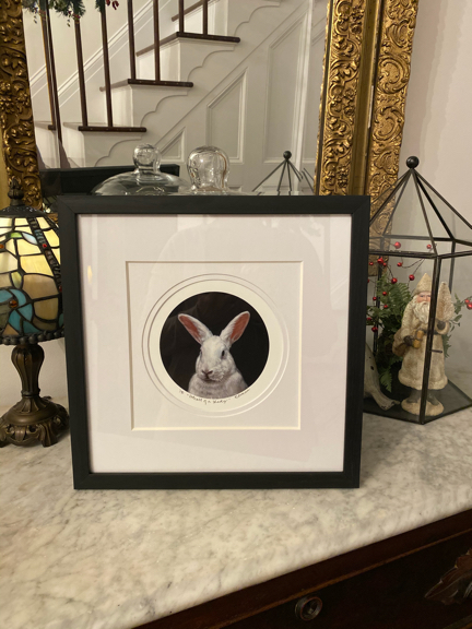
Framed by Theresa 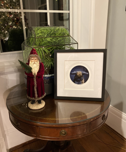
Framed by Theresa 
Framed by Theresa 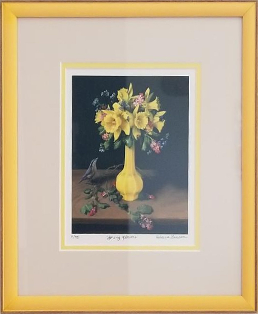
Framed by Sally 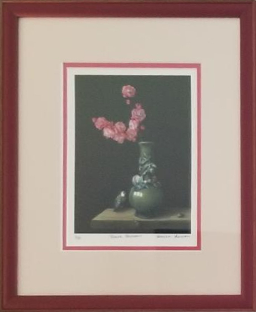
Framed by Sally