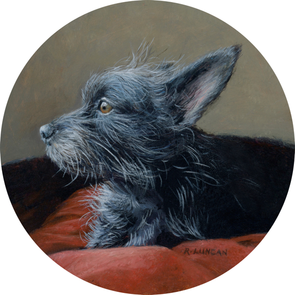
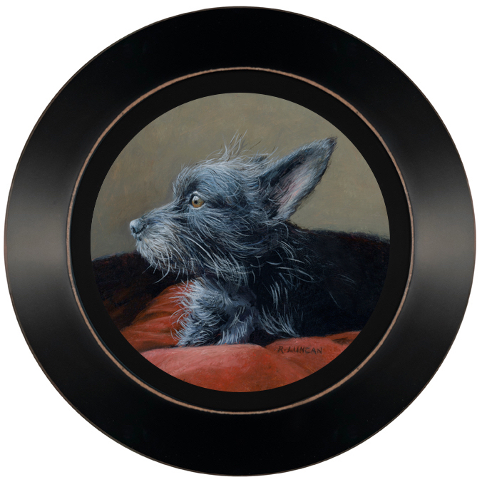
Tilly, oil on Aluminum, 4″ x 4″
The reference images for my pet portraits are almost always provided by clients—and the better the images, the better the painting turns out. This portrait of Arthur, a dignified Scottish Terrier, is a wonderful example of how strong reference photos can lead to a successful painting.
Strong Reference, Strong Portrait
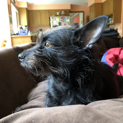
Tilly (Arthur’s human) sent me around twenty high-quality photos along with a clear vision: she wanted to see Arthur in a red chair or on a red cushion. What really made her images exceptional was the lighting and the angle.
Most of the photos were taken outdoors or next to a bright window. That natural light helps reveal accurate colors, fine details in the eyes, and the rich texture of fur. The image I ended up using as my primary reference is a perfect example of what a big difference a window can make.
Tilly also photographed Arthur at eye level in most of the images. That perspective helps reduce distortion and adds a sense of intimacy which is something I always aim for in my portraits.
If you’re planning to commission a portrait, I’ve shared some helpful tips for taking reference photos of your dog or your cat.


From Photo to Painting
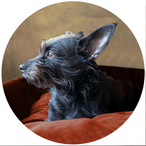
As shown in the images above, I always begin by creating a digital mock-up based on the client’s references. I adjust background shapes and colors to complement the subject and guide the viewer’s eye throughout the composition while keeping the focus firmly on the animal’s personality.
In Arthur’s case, I made a few key changes from the original image: I simplified the background considerably and lowered the top line of the chair so it sits just beneath his nose, which helps enhance his alert, poised expression. Other changes from the mock-up to the final painting were subtle refinements in color, contrast, and texture that came through as I worked.
While painting, I referred back to the other images Tilly sent to double-check details and keep things accurate. I softened the contrast in Arthur’s fur and muted the background slightly to give him more depth. That also made his eyes appear brighter. One final and important detail: I made sure to include the little tuft of hair that stuck straight up in nearly every other photo. Tilly mentioned it specifically, and I knew it had to be there.
From Tilly
“This is perfect! Thank you so much for working so hard on it. I’m absolutely in love…”
—Tilly
If you’re curious about commissioning your own pet portrait (or giving one as a gift), you can find information on pricing, gift vouchers, and timelines on my commissions page.
