Busy as a Bee! How many layers does it take to make a painting?

Into the Country- Honey Bees, oil on copper by Rebecca Luncan

Into the Country- Honey Bees, oil on copper, 4″ x 4″

Making a painting, one layer at a time.

As a new mom, my time is more precious then ever. Over the last few months, I’ve been finding ways to use the big and small (more like small and smaller) chunks of time so I’m sure to use all of my art making time wisely. To do this, looking at all the steps one by one was very useful for me. The process of making a painting is different for every artist, and below you will find the steps it takes for me to compete a painting, from start to finish. Commissions are slightly different, and I’ll share the steps for one of those in a future post.

  1. Sketching out the idea. First I need to know what I’m going to be painting. I brainstorm ideas in my sketch book, do research, play with different approaches to the composition and try to get an overall sense of what I’m wanting to accomplish. This is my favorite way to use small blocks of time.
  2. Photo session. I work from photographs, so now’s the time to get some images to paint from. It helps to have a strong concept in mind before taking photos, but it’s equally important to stay flexible, and to be open to new ideas as they come. Sometimes it goes just as planned, but occasionally it takes two photo sessions to get what I’m looking for, or I may even go with a different concept entirely!
  3. Photo editing.  Because my paintings are so detailed, I like to work out bugs in the composition in this stage, rather than as I paint. My reference image can look pieced together, but as long as the composition is balanced and the lighting is more or less how I want it, then the reference image does its job. I rarely make any alterations to the composition after this stage. Having worked as a graphic designer, doing this on the computer is really quick and natural for me.
  4. Painting Support. Once I figure out what the size and shape of my painting will be, I cut out the shape in either copper or aluminum and lightly sand the side I will be painting.
  5. Under-drawing. I always do a fairly detailed drawing on the metal before I begin applying paint. Since I’m not using paints here, I can do this step anywhere, and I can stop and start anytime. My new routine for the small paintings is to do my underdrawing while nursing.
  6. Under-painting. And now we’re finally going to start painting! The first layer of paint can be applied in full color or monochromatic, depending on the painting. Check out some of my paintings in this first stage in the In Progress category of my blog. This layer is usually fairly quick, but it’s best to have at least an hour, even for a miniature. Larger paintings will need several hours. I like to finish the underpainting all at once.
  7. Second Layer. I was taught in art school that you should work on every section of the painting during each painting session. This is to keep continuity in the palette and level of detail. After years of painting, however, I’ve found that it works for me to break up painting sessions during the second layer: working on the background first, then middle ground, then foreground. I do like to get every area of the painting to the same level of finish before adding much detail in any one area, though.
  8. Third layer. This is where the magic happens. Things start to look how they’re supposed to, and my subjects begin to come alive. It’s really important to have a nice long painting session for this layer. A focused two hours is the minimum. For a large painting, those nine-hour painting days (I kind of remember those!) feel amazing. It’s good to step back and look at the painting often during this stage. Sometimes an area that felt resolved will need some changes after another area is more finished, and my third layer, begins to become a fourth. Two good tricks during this stage are to take a photo or look at the painting in a mirror. Any “somethings just not right” mysteries are much easier to solve with a new perspective.
  9. Final touches. Here I’ll add a little or a lot, depending on how well that third (or fourth) layer went. This is my chance to make sure all the areas of the painting are tied together in terms of color mixing and for level of finish. I usually do this with glazing which is a painting process of adding translucent layers of paint.
  10. Finished! That’s it, right? Nope. Now the painting needs to be signed, varnished, documented and framed. There! Now it’s finished.
See all of the “Into the Country” Miniatures in the series on the Monthly Miniature page

Life of a Paintbrush

Quarter Horse Portrait in progress, oil on copper by Rebecca Luncan

Quarter Horse Portrait in progress, oil on copper


No matter your style, or your talent as an artist, the tools you use to make your artwork must also be up to the task.

An inventory of fresh brushes with nice, crisp points is essential, but sometimes even that isn’t enough. I go through several brushes even in these little paintings, and occasionally my worn brushes find new life when I need something finer than what I can buy. For instance, to get the fine detail in Chex’s eye, I trimmed a fraying brush down to a single hair.

Horse Portrait painting miniature, oil on copper by Rebecca Luncan

The completed painting,Quarter Horse (Chex My Cal Bar) – July 2016, oil on copper, 4″ x 4″

It’s hard to get a sense of how small this painting is, using my brush for reference in the in-progress image above, there’s already plenty of detail too fine for stock brushes.

This painting features my mother in law’s stallion, Chex. Chex My Cal Bar is a registered quarter horse with an excellent pedigree. A stallion for the first seventeen years of his life, he sired several foals. He was amazingly talented and athletic in his younger years, especially in his element “cutting” cows. He was gentle enough to put children or inexperienced riders on his back, and still is. Now retired, he spends his days with his daughter April and his longtime buddy Romeo, a miniature horse.


Portrait of a Belgian d’Anver Bantam (aka Chicken!)

Belgian d'Anver Bantam, oil painting on copper by Rebecca Luncan

Belgian d’Anver Bantam, oil painting on copper by Rebecca Luncan
4″ x 4″


A New Series brings new challenges and a new style of frame

I was excited to realize that this is not only my first painting of a chicken, but my first painting of any bird! It was a wonderful challenge to create volume from all those feathers, and I look forward to painting more birds. Anyone out there want to commission me to paint your special feathered friend?

The artist Rebecca Luncan and her painting of a Chicken - May 2016 oil on copper

The artist and her painting of a Chicken

Custom Frames for Into the Country

The multi-talented Daniel Carrillo, owner of Gallery Frames in Seattle, made custom frames for this series. If I can’t do it myself because of time or lack of proper equipment, Dan is my favorite framer in Seattle. I’m very thankful that there is a framer in town that can actually cut such tiny frames (most can’t!) with such a high degree of workmanship.
Custom frames by Gallery Frames for "into the Country" miniature painting series by Rebecca Luncan

Custom frames by Gallery Frames for “into the Country” miniature painting series

Besides being a fantastic framer, Daniel is also a very talented photographer. His recent work makes use of antique photography methods such as Daguerreotypes and wet plate collodion Ambrotypes. Take a look at his website to see some of his beautiful work.


Two very different approaches to painting the landscape

trees

Left: Landscape in the nursery, Right: Vigil (in progress)

A playful mural and a very serious oil painting

For the last two months, I’ve been working hard on two very different projects featuring landscapes. The landscape doesn’t often play such a primary role in my artwork and it’s turned out to be a fortunate coincidence that I’m working on both of these paintings at the same time.


WIP-Vigil-Barn2

This is a painting featuring my sister-in-law Molly, the second of a planned series of five (check out the first painting in the series, Vigil). In this painting, she surveys her property on the outskirts of Seattle. In terms of hours, I’d say it’s just over half done, and although I’m feeling good about my progress, it’ll be a while before I can call it finished. But I finally feel like I’ve got the sky figured out, after going back and forth between it and the trees session after session.


mural1

This landscape painting couldn’t be more different from the first one. It’s a mural I painted for the baby’s nursery (I’m in the ninth month of pregnancy!) with the help of several friends. It has been quite a learning curve for me, since I normally paint small works in oil, typically referencing a photograph closely, whereas this is a full-height, wall-to-wall painting in acrylic, stitched together on the fly from many images, views out the window, and even painted from imagination.

It has been really interesting to compare the very different ways of going about the actual painting process, and very freeing for me. I am noticing changes lately in how I approach my work, as I become more spontaneous and intuitive in both the planning and execution of my paintings. In the oil painting above (Molly looking into the landscape), for instance, my head is spinning trying to keep track of every little tangled branch, and I am coming to realize that maybe they don’t all need to end up in the painting at the same exact location as in my source image. I’ve been working so closely from a reference for my paintings for so long that I don’t allow myself much freedom. But it feels like such a relief to think that I can still look and reference this image, but rely a bit more on my intuition in future.

I hope you’ll keep an eye out for a more in-depth post about the mural and to see how the oil painting turns out!

My new Gallery of Interactive Paintings is up Featuring Animated Images

interactive oil painting of gypsy by Rebecca LuncanPainting on metal has many advantages and allowing me to make sculptural paintings is definitely one of them.

The interactive painting series was an especially exciting revelation for me. In my early years of art school, I was undecided between sculpture and painting and took several sculpture classes. Though I did enjoy sculpting, it became clear early on that painting was my true passion. I love how these paintings combine my love of painting with a playful sculptural element that has always intrigued me. They are difficult to make since everything has to be perfectly aligned, all of the frames are custom made, and I have to epoxy finished paintings together (very stressful!). I must love making them, though! I’ve made over 40 of these pieces over the years and I’m still making them as commissioned pieces.

The gallery features a sampling of these paintings and for those of you that haven’t had a chance to play with these paintings in person, many of the images are animated to help clarify how these paintings work. I hope you’ll take a look!!


post

Antique Frame Transformed for the August Monthly Miniature with French Polish

The discovery and restoration of a meticulously crafted, one hundred year old frame for Charlemagne in Profile

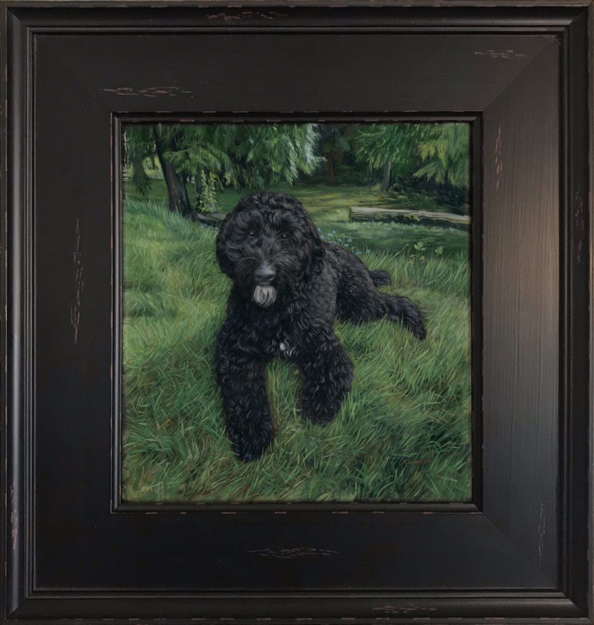
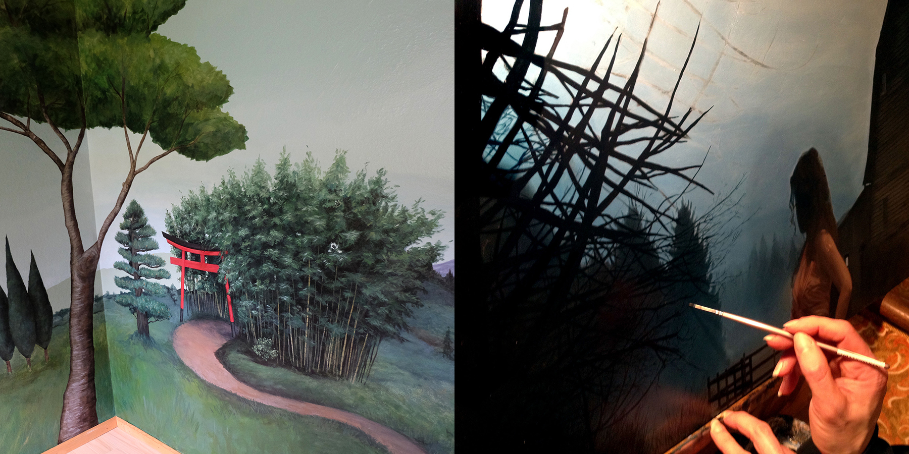
My sister is passionate about antiques. Most weekends will find her traveling to different auctions, estate sales, and antique shops, on the hunt for something unusual that catches her imagination. About a year ago, she called me up, excited about a sale of wooden frames produced by the The Castner Picture Frame Company in the early 1900’s. The company meticulously produced frames from scratch for more than a century before shutting down. The Mohawk Building in Cincinnati was left with thousands of uniquely designed frames ranging drastically in size and level of detailing. Wooden frames aren’t a rarity, but wooden miniature frames most certainly are, and here they had them them in abundance!

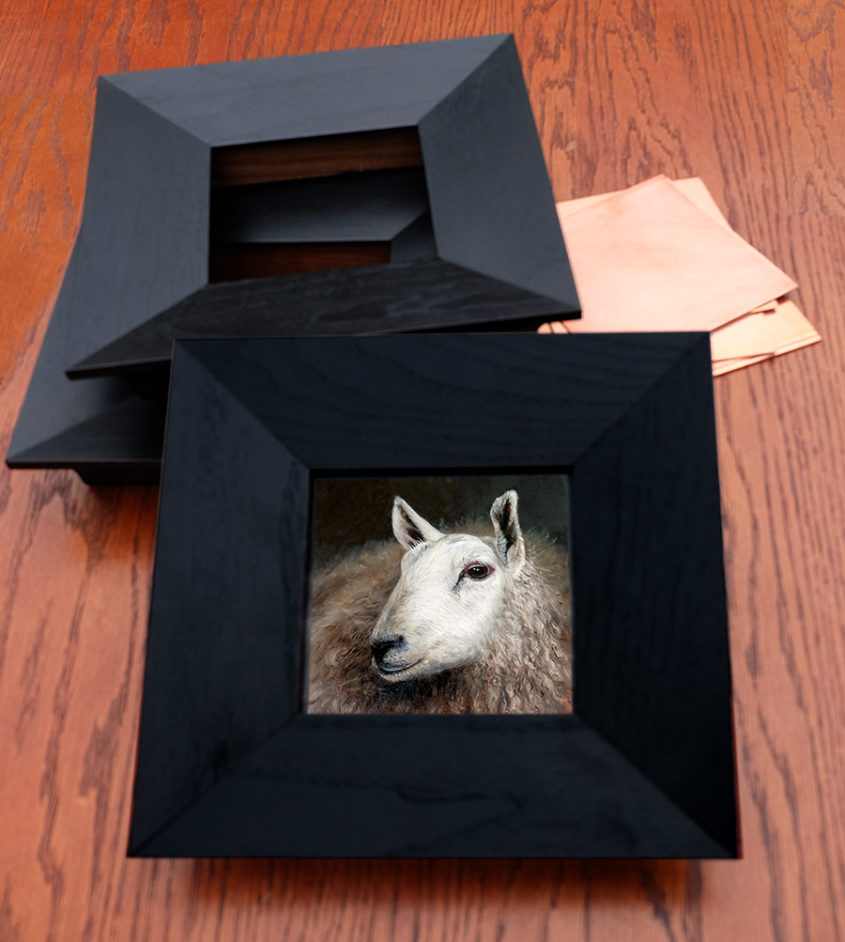
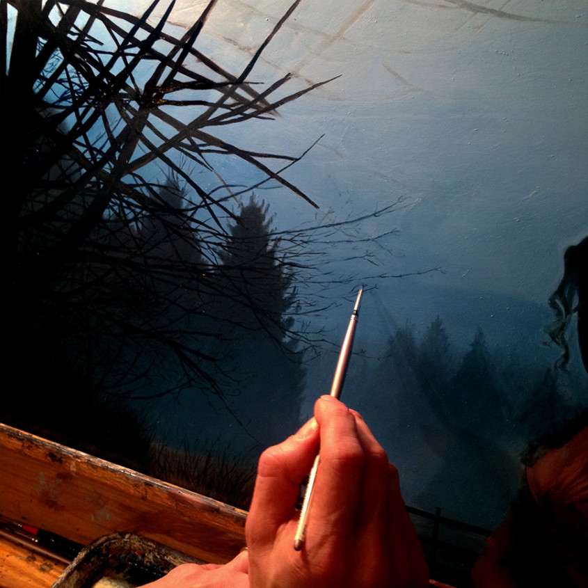
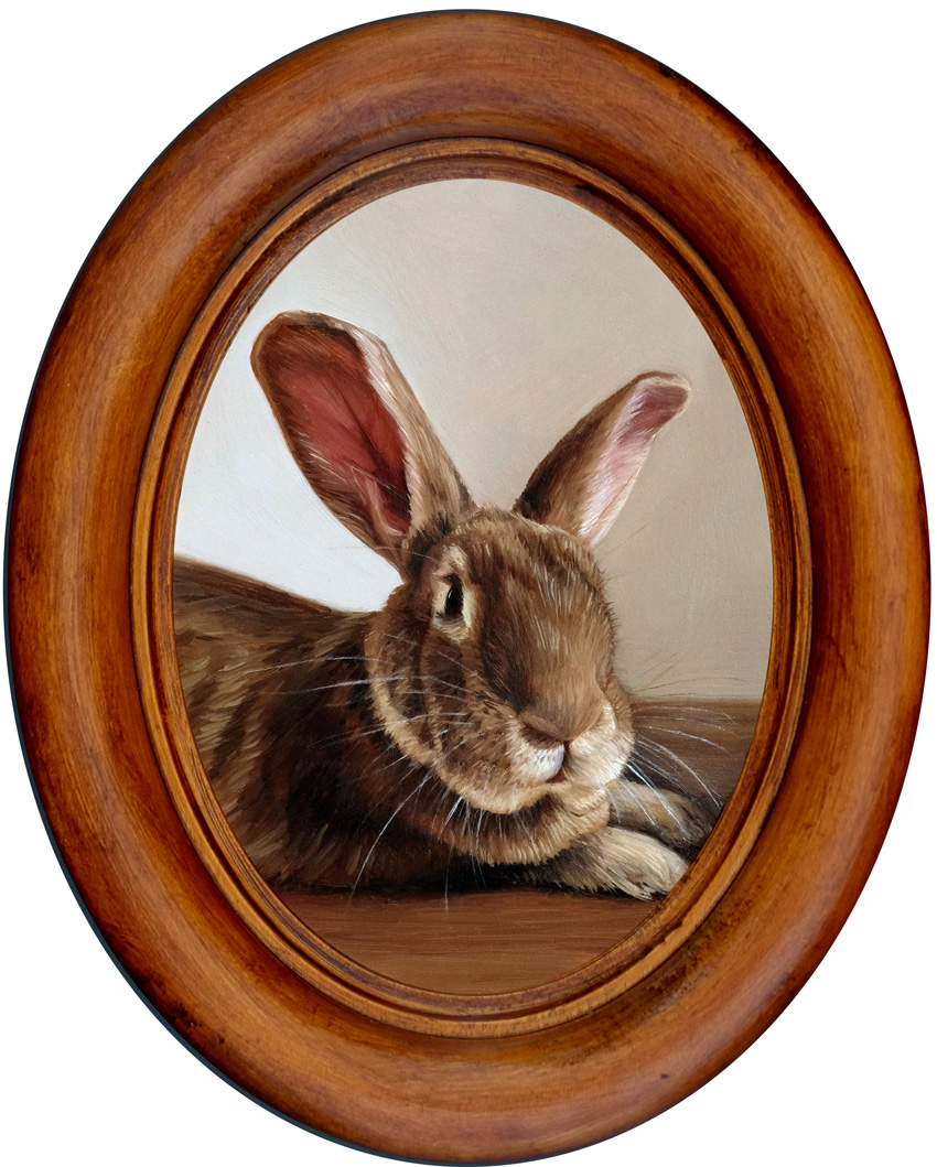
We excitedly talked on the phone and texted back and forth as the date of the sale approached, and she ended up buying around 60 small frames. I was mostly interested in small circular frames, but thankfully, she couldn’t pass up some beautiful wooden ovals as well. Most of the ovals are unfinished, while the circular frames are almost all primed for painting or gilding. What a rare opportunity! They clean up beautifully, and I’ve treasured each one as I painted or polished it to fit portraits of people and rabbits.

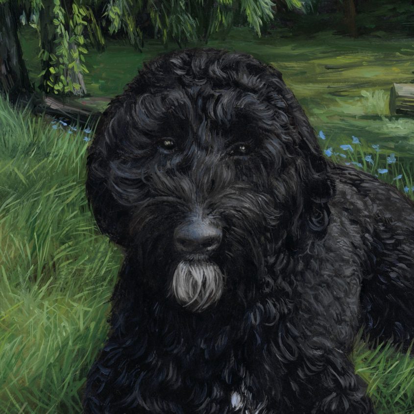
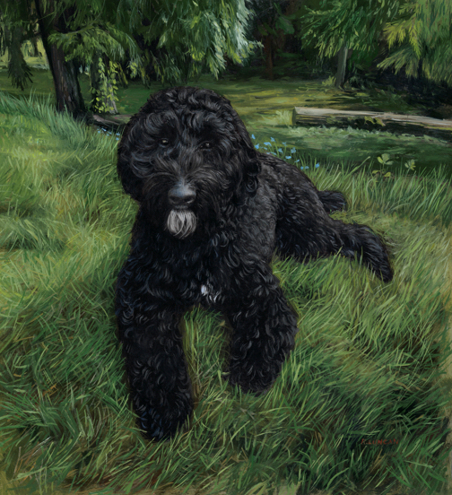
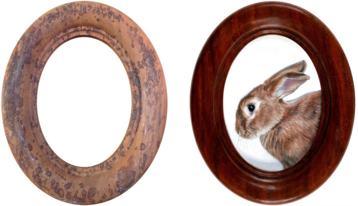
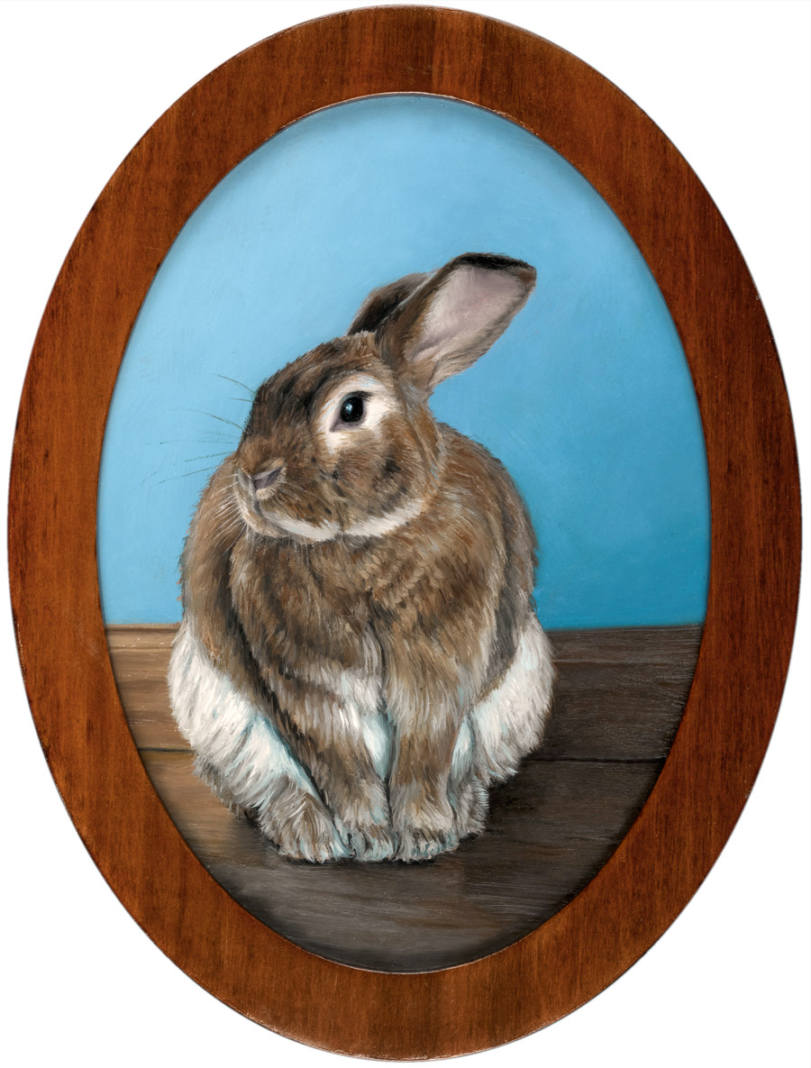
All of the rabbit monthly miniatures are framed in one of these frames, but I chose to highlight this one in particular because the transformation was so dramatic. It was so dirty and covered in mysterious spots that I had little hope in finishing it, but as I worked, the spots disappeared, and the grain became richer and more beautiful with each step of the process. It’s my favorite so far, and I chose to use if for this minimal painting of Charlie, the simple white background allowing the frame to shine.

French Polish: Step-by-step

French polishing is a technique of finishing wood with shellac as the main ingredient. This technique was popular in the late 1800’s for furniture but it is often overlooked in contemporary furniture finishing due to it’s low resistance to damage from water and heat as well as its labor intensive application process. It is still a favorite for musical instruments because of it’s unique ability to be be applied effectively in extremely thin coats leaves musical instruments with a nice clear sound. Many fine woodworkers also continue to use it, especially on antiques because the rich depth of the finish is difficult to rival with modern materials. As my frames shouldn’t come into contact with either heat or water, it’s an ideal finishing process for me.

Materials

  • shellac*
  • pumice
  • Renaissance  wax
  • denatured alcohol
  • cotton batting (or cotton balls)
  • soft cloth or cheesecloth
  • sandpaper (280, 320, 400 and 600 grit)
  • 2 cheap 1″ – 2″  brushes
  • walnut or olive oil
  • dust mask

*I’m using a premixed solution but you can buy shellac flakes and dissolve it yourself
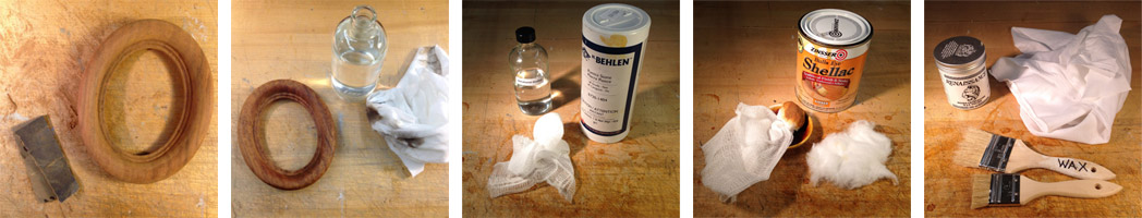
Step One: Clean

Clean the surface with denatured alcohol and a soft cloth.

Step Two: Sand

Sand the frame with progressively finer grits of sandpaper (starting with 280 and progressing to 600).

Step Three: Rub with Alcohol & Pumice

Make a fad by wrapping your soft cloth or cheesecloth around a wad of cotton that has soaked in alcohol. You can now sprinkle a bit of pumice on the frame, making sure to wear your dust mask. Rub the frame vigorously with the fad, and if it starts to catch on the grain, add a drop of oil.

Step Four: Rub with Shellac

Make a new, second fad, this time soaking in shellac instead of alcohol, and again rub vigorously with as random a pattern as possible. Reapply shellac to the inside of the fad (by dipping the cotton ball) as needed.

Step Five: Repeat, then Dry

Repeat steps three and four a few times, letting it dry for several hours between coats. Pay careful attention that you don’t get too much shellac building up on ridges and valleys of the frame, as you will want these details to stand out. The process of working the abrasive pumice and shellac alternately is called the “British Method” of French polishing. The alternative, using both the shellac and abrasive at the same time is the original, or “French Method”.

Let dry overnight.

Step Six: Final Rub with Alcohol

Make a new fad using just alcohol, and gently glide it over the surface. You want to remove any oil that may be on the surface and even out the final coat of shellac. Don’t press so hard that you begin removing the shellac, however. At this point, the frame just glows, and it’s hard to stop touching the silky-smooth surface. But stop touching for now, and leave it overnight.

Step Seven: Wax and Buff

Brush on a very very thin coat of Renaissance wax. Let it dry for 10 minutes, then buff it off with a clean cloth or a stiff brush. Give it another 24 hours to dry and your frame is finished! Now you can touch it.

Finishing miniature frames

Shellac: Yes, it’s made from bugs!

The critical material for a french polish is shellac. Made from lac, an amber colored resinous material produced by the female Kerria lacca insect, which forms a tunnel around the insect and serves as a kind of cocoon to incubate the eggs she lays. Shellac is a non-toxic material that’s even rated as food-safe by the FDA and has a plethora of wide-ranging uses. Not only to be found in furniture, it can also be found on your jelly beans, guitar, and in nail polish. It’s relatively easy to harvest by scraping it off the bark of the trees, and refining can simply be done by heating it over a fire then filtering once it liquefies to remove any stray insects or bits of bark. It has been used for centuries to polish furniture in the native countries of these insects, Thailand and India. The french polishing technique, which became prominent in the 18th century, is still commonly used to polish furniture and musical instruments throughout the world today.

Rabbit oil painting miniature by Rebecca Luncan

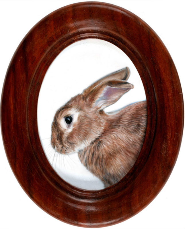
Charliemagne in Porfile
oil on aluminum
3.75″ x 2.75″

Phthalo: the Forbidden Blue (July Monthly Miniature)

Rabbit Painting Miniature Rebecca Luncan

My fourth Monthly Miniature is featured with a phthalo blue background, a color long excluded from my palette.

How embarrassing that I was afraid of a tube of paint. I like to think of myself as not really afraid of anything, but I gave my last tube of phthalo blue away many years ago because I was afraid it would invade my paintings.

Phthalo blue is a relatively new pigment, accidentally discovered and rediscovered in the lab before its potential was finally recognized by the company Scottish Dyes in the early 1900’s. It was introduced as an artist pigment in the mid 1930’s and has been highly valued ever since for it’s resistance to fading, intense color, and high tinting strength.

That high tinting strength is the source of my fears. You have to understand how invasive phthalo blue is: during the course of a painting, hues naturally blend and migrate. While most pigments can be blended into entirely new colors, either dominating and being dominated by other hues, phthalo blue tints so powerfully that it is extremely difficult to blend away in that manner. If it’s on the pallet, I can see it in the painting everywhere! Typically as a figurative painter, creating warm skin tones helps give the person a more vibrant, lively feel, so my general rule has been to only use Cobalt Blue (which has a weak tinting strength) so that the warm tones are easy to pull forward with a greater sense of control. Whereas a tiny bit of phthalo blue on the pallet has a way of invading everything and can quickly force you to scrape your entire palette clean and start again, thus the expulsion of the color from my studio.

Two paintings changed my perspective, and now I can’t imagine working without it.

I spend a great deal of time at the Seattle Art Museum, where I help create mounts that stabilize objects on display and mitigate earthquake risk. And though I’m mostly working with sculptural pieces, I love spending time with the paintings. March of 2014 brought “France: Inside and Out“, an ongoing show in the fourth floor galleries (co-curated by Chiyo Ishikawa and Julie Emerson), and though the portrait below was painted before the advent of phthalo blue, it started me questioning my fear of a dominating cool pigment in a portrait. The blue is everywhere in this painting: the frame, the hair, and the skin, not to mention the blue dress and background. But at the same time, it’s neither monochromatic nor muddy. This painting planted the thought that maybe it’s okay to let go of some control and let the paint surprise me.

Berthe Morisot, Lucie Léon at the Piano, oil on canvas, 1892 Collection of the Seattle Art Museum

Berthe Morisot, Lucie Léon at the Piano, oil on canvas, 1892 Collection of the Seattle Art Museum

That planted thought found unexpectedly fertile ground this February, when my partner Evan and I showed up at his sister Molly’s small farm in Arlington, WA just before dusk. I wanted to begin a series that actively connected the figure and landscape, and we had come to gather images. The winter fog rolled into the valley, across the fields, and all around the trees, barns, and all of us. The sun had begun to set, turning the foggy hills a deep and vibrant blue, and mysterious lights haunted in the distance. As a subject, Molly is as dramatic as the background that evening, and as we finished, I couldn’t wait to begin the new series.

But as I began to paint, I tried blue after blue but none of them worked. Nothing came close to the shockingly blue sky we had witnessed. I finally conceded that I needed phthalo blue, and I bought my first tube of it in over 10 years. It delivered where other blues had fallen short, and although I only used it in the background in this painting, it helped me shake off some of my longtime inhibitions. In my fourth Monthly Miniature, I also used phthalo blue, and if you look closely, I have used it much more freely, adding it to the floor and the figure. Adding it in the highlights in Charlie’s soft belly fur was truly freeing and a moment of joy. Instead of fearing the phthalo invasion, I invited it in and listened to what it had to say. I’m pleased to say it had some nice ideas, and we’ll be working together again soon.

Portrait oil painting Rebecca Luncan

Vigil, Oil on Aluminum panel, 15″ x 15″, 2015

Pet Portrait Commission Underpainting of Leo the Cat

Cat-painting_in-progress_rebecca-luncan

The pet portrait of Leo the cat is seen in the first stages of the underpainting, where you can catch a glimpse of my process.

I like to make quick, loose underpaintings on top of an underdrawing before I get fussy with details. Many people like to do monochromatic underpaintings (also called grisaille) but I prefer to use full color because it helps in balancing the composition. I blocked this painting out as seen above, but I often start painting with just black (mixed burnt umber and ultramarine blue), as in the Bride of Frankenstein Mismatched Portrait, then go back to block in the rest after it’s dry.

Why do an underpainting?

First, it’s helpful to figure out the composition quickly before too much time is spent adding details that may need to be changed later. Small alterations are part of the process, but this step can help prevent big changes later.

Second, having multiple layers of paint creates a depth and richness that is visible in the final painting.

And third, when done properly with a “fat over lean” technique, a lean underpainting can help prevent cracking in later years. A lean layer uses very little oil medium (though you can use artist’s grade turpentine or similar) and typically uses paint colors that dry quickly. Because a lean layer has a high proportion of pigment granules per volume of oil binder, the paint film has a rough surface that allows subsequent layers to grab and stick more effectively. This lean layer is brittle on its own, but it is protected by subsequent ‘fat’ layers (lower pigment to oil ratio) that are more flexible and resistant to cracking, though they take longer to dry.

My Underpainting Palette

Oil paint colors dry at different rates and those that dry more quickly are ideal for use in the underpainting. For my underpainting, I typically use a Flake White Hue (a less toxic lead-free replacement to traditional Flake White), Cobalt Yellow, Venetian Red, Cobalt Blue, Ultramarine Blue, and Burnt Umber. Other quick drying colors are Cobalt Green, Manganese Blue, Prussian Blue, Manganese Violet, Raw Sienna and Burnt Sienna.

Have an underpainting palette you love? Please share in the comments!

Infrared reflectogram detail of Jan Van Eyck’s painting

Take a look at this wonderfully detailed conservation report of Jan Van Eyck’s Margaret, the Artist’s Wife. I love seeing the infrared reflectogram details showing how the underpainting was slightly different than the final painting. The Italians have given us a word for this phenomenon: pentimento.

Visit the Commissions page if you’ve ever considered commissioning a portrait of your own, and follow me on Instagram to see more images of paintings in-progress.

post

Painting on Copper – May Monthly Miniature

My second Monthly Miniature of Charlemagne the rabbit, follows a 500 year tradition of painting on copper primed with a clove of garlic.

Lavinia_Fontana_-_Self-Portrait_in_a_Tondo_-_WGA7986

Lavinia Fontana (1552-1614)-Self-Portrait in a Tondo, 1597, oil on copper

Paintings on copper have been made by European artists since the mid 1500’s. Many examples from those first few hundred years survive even better than their canvas and wood panel counterparts.

Then as now, copper surfaces are first lightly sanded, cleaned with denatured alcohol, and topped with an optional layer of garlic juice. Garlic juice etches the surface of the copper and it’s most effective if followed by a coat of lead white. The process hasn’t changed over the years, except many more artists today (myself included) avoid the highly toxic lead white paint.

Artists don’t often get to grow their own art supplies. The garden is another huge creative outlet for me, and now a tiny bit of it is in this painting.

Fearsome Bală stalking in the garlic patch, Photo credit: Evan Grim

My cat, Bală stalking in the garlic patch, Photo credit: Evan Grim

Check out Alberti’s Window, An art History Blog for an in depth discussion about Lavinia Fontana’s self-portrait above in reference to her being a female painter in the 1500’s.

Subscribe to preview the Monthly Miniatures & get news about upcoming shows