Rabbit Greeting Card Giveaway: the Monthly Miniature Series is Half Finished!

Rabbit_greeting_Cards

Celebrate with me!

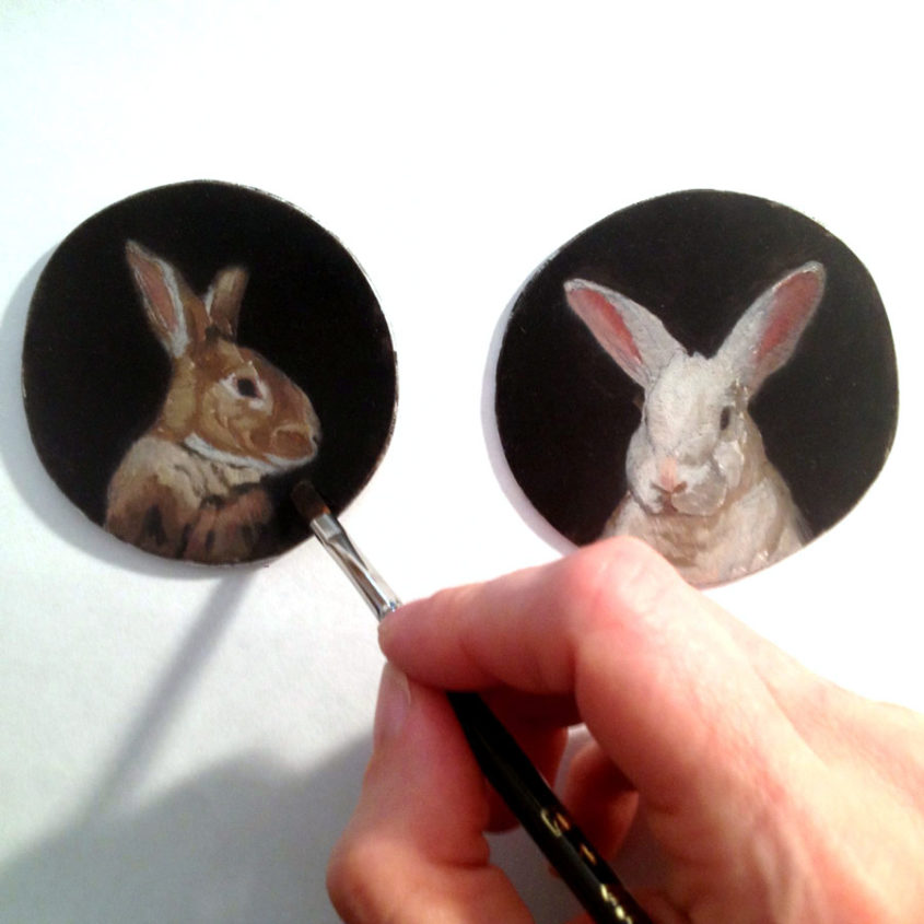
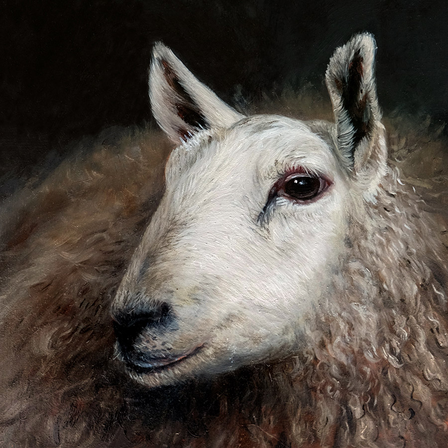
I’m pleased to say I’m halfway through my “Monthly Miniature – Rabbits” project. I’ve printed greeting cards of all six paintings to mark the occasion, and now I want to give some away! The first six subscribers that reply to the September Monthly Miniature Newsletter will get a set of cards for free, so check your inboxes! If you miss your chance, don’t worry, you can purchase them from my site starting September 7th.

I’ve thoroughly enjoyed making these paintings, and I’m excited for the next six. It’s amazing how there’s always something new to explore within such a narrow focus. The project so far has been really inspiring for me, and I’m brimming with ideas for the miniatures. I’ve also been dying to do some larger paintings of the rabbits, like a giant portrait of Charlie that will have to come into the world one day. But for now, the little ones will keep coming, once a month, as promised.

Thanks for following the Monthly Miniatures. And if you aren’t already on my newsletter, please sign up!

My new Gallery of Interactive Paintings is up Featuring Animated Images

interactive oil painting of gypsy by Rebecca LuncanPainting on metal has many advantages and allowing me to make sculptural paintings is definitely one of them.

The interactive painting series was an especially exciting revelation for me. In my early years of art school, I was undecided between sculpture and painting and took several sculpture classes. Though I did enjoy sculpting, it became clear early on that painting was my true passion. I love how these paintings combine my love of painting with a playful sculptural element that has always intrigued me. They are difficult to make since everything has to be perfectly aligned, all of the frames are custom made, and I have to epoxy finished paintings together (very stressful!). I must love making them, though! I’ve made over 40 of these pieces over the years and I’m still making them as commissioned pieces.

The gallery features a sampling of these paintings and for those of you that haven’t had a chance to play with these paintings in person, many of the images are animated to help clarify how these paintings work. I hope you’ll take a look!!


Shadowbox: Group Show at Ghost Gallery

interactive oil painting of Sisters by Rebecca Luncan

Two of my double-sided paintings will be included in a show at Ghost Gallery this month!

Though the theme of “shadowbox” seems specific, the work will be extremely varied in subject matter and the use of materials (from taxidermy to crochet and everything in between). The exhibition features more than thirty local & national female-identifying artists. I’m looking forward to seeing my paintings displayed in such a diverse context and I hope some of you locals out there can make it!  Here’s the Facebook Invite.

The artist reception is from 5:00 – 9:00 during Capitol Hill’s Second Thursday Artwalk on August 13th. Show is open August 13th – September 3rd, 2015. 

Ghost Gallery, 504 E Denny Way, Seattle, WA (entrance faces Olive Way) Hours: TUE-FRI 11-7pm, SAT-SUN 11-6pm Monday by Appt

Double sided interactive oil painting of Solider going to war by Rebecca Luncan

Participating artists include:

Amber Imrie-Situnayake (CA)

Amber Maykut (Brooklyn)

Anastasia Zielinski

Anne La Fever

Bunneah Munkeah

Caitlin McCormack (PA)

Clarita Hinojosa

Crystal Blanchflower

Danielle Schlunegger (CA)

Domonique Alesi (PA)

Donia (NYC)

Elizabeth Arzani

Emily Marie Clark

Holly Martz

Ilona Brustad

Inna Peck

Jessica Bonin

Jody Joldersma

Kaitlin Beckett (Melbourne)

Karla Fuller-Palmer

Krisna Schumann

Kristine Helgager

Laura Tempest Zakroff

Lisa Mei Ling Fong

Michelle Smith-Lewis

Meredith Stafford

Patricia Sullivan (NJ)

Rebecca Luncan

Rebecca Reeves (PA)

Shayna Yasuhara (CA)

Whitney Bashaw

Zoë Williams (NY)


post

Antique Frame Transformed for the August Monthly Miniature with French Polish

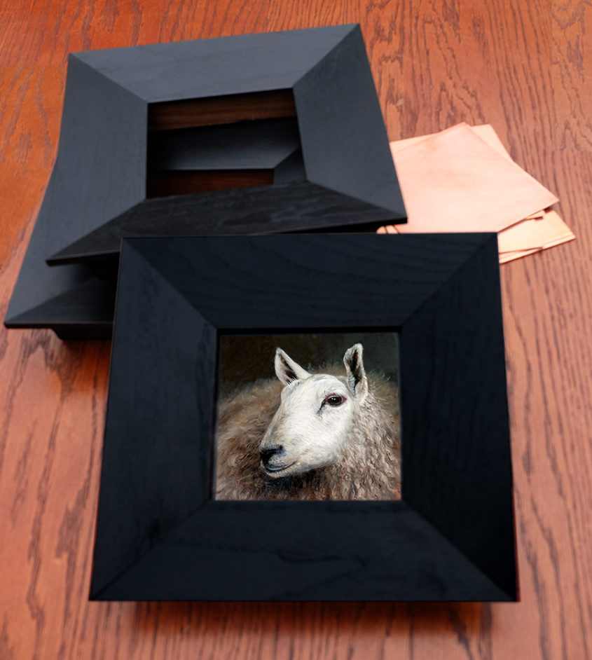
The discovery and restoration of a meticulously crafted, one hundred year old frame for Charlemagne in Profile

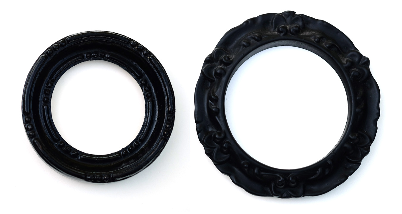
My sister is passionate about antiques. Most weekends will find her traveling to different auctions, estate sales, and antique shops, on the hunt for something unusual that catches her imagination. About a year ago, she called me up, excited about a sale of wooden frames produced by the The Castner Picture Frame Company in the early 1900’s. The company meticulously produced frames from scratch for more than a century before shutting down. The Mohawk Building in Cincinnati was left with thousands of uniquely designed frames ranging drastically in size and level of detailing. Wooden frames aren’t a rarity, but wooden miniature frames most certainly are, and here they had them them in abundance!

We excitedly talked on the phone and texted back and forth as the date of the sale approached, and she ended up buying around 60 small frames. I was mostly interested in small circular frames, but thankfully, she couldn’t pass up some beautiful wooden ovals as well. Most of the ovals are unfinished, while the circular frames are almost all primed for painting or gilding. What a rare opportunity! They clean up beautifully, and I’ve treasured each one as I painted or polished it to fit portraits of people and rabbits.

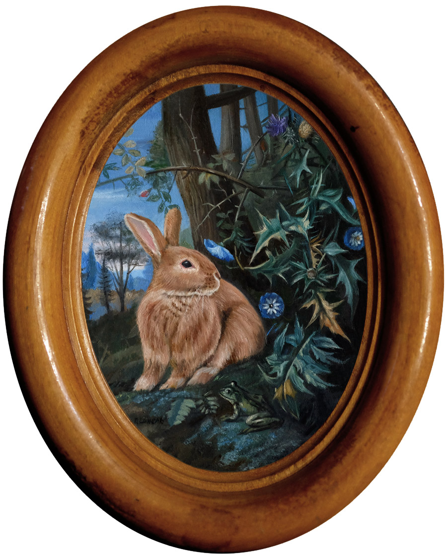
All of the rabbit monthly miniatures are framed in one of these frames, but I chose to highlight this one in particular because the transformation was so dramatic. It was so dirty and covered in mysterious spots that I had little hope in finishing it, but as I worked, the spots disappeared, and the grain became richer and more beautiful with each step of the process. It’s my favorite so far, and I chose to use if for this minimal painting of Charlie, the simple white background allowing the frame to shine.

French Polish: Step-by-step

French polishing is a technique of finishing wood with shellac as the main ingredient. This technique was popular in the late 1800’s for furniture but it is often overlooked in contemporary furniture finishing due to it’s low resistance to damage from water and heat as well as its labor intensive application process. It is still a favorite for musical instruments because of it’s unique ability to be be applied effectively in extremely thin coats leaves musical instruments with a nice clear sound. Many fine woodworkers also continue to use it, especially on antiques because the rich depth of the finish is difficult to rival with modern materials. As my frames shouldn’t come into contact with either heat or water, it’s an ideal finishing process for me.

Materials

  • shellac*
  • pumice
  • Renaissance  wax
  • denatured alcohol
  • cotton batting (or cotton balls)
  • soft cloth or cheesecloth
  • sandpaper (280, 320, 400 and 600 grit)
  • 2 cheap 1″ – 2″  brushes
  • walnut or olive oil
  • dust mask

*I’m using a premixed solution but you can buy shellac flakes and dissolve it yourself

Step One: Clean

Clean the surface with denatured alcohol and a soft cloth.

Step Two: Sand

Sand the frame with progressively finer grits of sandpaper (starting with 280 and progressing to 600).

Step Three: Rub with Alcohol & Pumice

Make a fad by wrapping your soft cloth or cheesecloth around a wad of cotton that has soaked in alcohol. You can now sprinkle a bit of pumice on the frame, making sure to wear your dust mask. Rub the frame vigorously with the fad, and if it starts to catch on the grain, add a drop of oil.

Step Four: Rub with Shellac

Make a new, second fad, this time soaking in shellac instead of alcohol, and again rub vigorously with as random a pattern as possible. Reapply shellac to the inside of the fad (by dipping the cotton ball) as needed.

Step Five: Repeat, then Dry

Repeat steps three and four a few times, letting it dry for several hours between coats. Pay careful attention that you don’t get too much shellac building up on ridges and valleys of the frame, as you will want these details to stand out. The process of working the abrasive pumice and shellac alternately is called the “British Method” of French polishing. The alternative, using both the shellac and abrasive at the same time is the original, or “French Method”.

Let dry overnight.

Step Six: Final Rub with Alcohol

Make a new fad using just alcohol, and gently glide it over the surface. You want to remove any oil that may be on the surface and even out the final coat of shellac. Don’t press so hard that you begin removing the shellac, however. At this point, the frame just glows, and it’s hard to stop touching the silky-smooth surface. But stop touching for now, and leave it overnight.

Step Seven: Wax and Buff

Brush on a very very thin coat of Renaissance wax. Let it dry for 10 minutes, then buff it off with a clean cloth or a stiff brush. Give it another 24 hours to dry and your frame is finished! Now you can touch it.

Finishing miniature frames

Shellac: Yes, it’s made from bugs!

The critical material for a french polish is shellac. Made from lac, an amber colored resinous material produced by the female Kerria lacca insect, which forms a tunnel around the insect and serves as a kind of cocoon to incubate the eggs she lays. Shellac is a non-toxic material that’s even rated as food-safe by the FDA and has a plethora of wide-ranging uses. Not only to be found in furniture, it can also be found on your jelly beans, guitar, and in nail polish. It’s relatively easy to harvest by scraping it off the bark of the trees, and refining can simply be done by heating it over a fire then filtering once it liquefies to remove any stray insects or bits of bark. It has been used for centuries to polish furniture in the native countries of these insects, Thailand and India. The french polishing technique, which became prominent in the 18th century, is still commonly used to polish furniture and musical instruments throughout the world today.

Rabbit oil painting miniature by Rebecca Luncan

Charliemagne in Porfile
oil on aluminum
3.75″ x 2.75″

Signing Artwork: Making Ties to the Past

signature

A piece of artwork has two identities; a signature binds the one to the other.

The first identity is the object, there in front of you, awaiting your gaze. The reckless or the deliberate brushstrokes, the smooth sheen on a carefully sculpted piece of marble, the lovely hatch-marks on an etching, all the little details that pull you in and make each piece of artwork unique. The second identity is the story of the artwork and its journey through the world. Who made it? Why? Where was it exhibited? Was it part of a bigger series? Who is the person in the portrait? and who has owned it? This story is called the provenance.

Like it or not, a work of art does not stand completely on its own: both its story and its physical character are important. Some degree of provenance helps work keep its value over time, and more valued work is more likely to be well-treated. But until artwork is identified, it effectively has little provenance. When someone is faced with a decision about what to do with a piece of art, the identity of its creator is important. So to make it more likely your work will be treated well, found and remembered, it is important to sign it clearly. Alan Bamberger is, among other things, an art consultant and independent appraiser specializing in original works of art. His article about artist’s signing artwork goes as far as saying, “No matter what your signature looks like, what form it takes or where you put it, no work of your art is complete without one.”

Where to Sign? and Other Guidelines

Where to sign artwork is the most debated part of the process. Painter Alice Neel did a huge signature and the date on the front of her paintings, but you’d never see a Georgia O’Keeffe signed on the front. Hers were restricted to the back, either on the canvas or stretcher frame. I was taught in art school to sign paintings on the back so it doesn’t take attention away from the artwork. That’s only one school of thought, but it’s how I’ve done it since then.

I do have one patron that likes me to sign paintings on the front, and at her request, I’ve been signing paintings she’s purchased that way. I try to hide the signature a bit and it’s starting me questioning whether or not I should hide a little signature on the front on all of them. It always seems so glaringly obvious to me, but when I just showed a friend one piece, he had to get out a magnifying glass to find it, so maybe it isn’t so distracting after all. I’m going to do a little experimenting, so keep your magnifying glasses at the ready.

Other things to consider:

  • If your signature isn’t legible, why bother? Note that even the well known artists in the image above have pretty clear signatures. There are websites dedicated to identifying paintings with illegible signatures (and they are not always successful).
  • Keeping the look and placement of your signature consistent makes it easier to locate.
  • Paintings and drawings are easier to authenticate if the signature is done in the same medium as the artwork.
  • Your name may change. Consistency is important, but you just do the best you can do. It seemed like a good idea to go by Rebecca Raven after I got married, but going back to my maiden name after getting divorced means there are 9 years worth of little painting out in the world without my name on them! If you see a Rebecca Raven out in the world, you’re welcome to contact me and I’ll be happy to verify if for you. I keep excellent records.

Interesting Signatures

Signatures take many forms, from a simple hand-written or painted signature to pictographs or monograms; a traditional method of signature in China and Japan is to stamp artwork with a personal seal (a chop). Signatures themselves can have their own stories, and can be a reminder of the artist’s life and times. Here are two signatures that I found particularly interesting.

Whistler’s signature made an interesting transformation into the image of a butterfly, inspired by his studies of the artists “chops” found in Asian artwork, which was flooding Europe after Japan became open to trade in 1854. He sometimes hides the butterfly in unexpected places, such as the frame on the painting. Both the early and late versions of his signature are shown next to each other in the image above.

Joseph Cornell (not pictured above) presented me with a mystery. I’ve had the privilege to handle dozens of his pieces in my mount-making capacity at the Seattle Art Museum, and noticed many pieces attributed to him are signed, Robert Cornell. With the help of Wikipedia, I discovered that this Robert was Joseph’s younger brother who was disabled and had cerebral palsy. Though I never learned the exact significance of the signature, I was touched to learn that the artist devoted his life to caring for his little brother.

A Good Read About Provenance

content

I’m just finished reading a beautiful family memoir that I highly recommend called, The Hare with Amber Eyes: a Hidden Inheritance by Edmund de Waal. The author “traces the collection (of small Japanese sculpture called netsuke) from Japan to Europe…and back to Japan and Europe again”. It’s a profound take on provenance, and how much the things around us, that we invite into our homes, can become intertwined with our own histories.

Commissioning a Pet Portrait: the Owner’s Connection

Cat pet Portrait oil painting Rebecca LuncanCreating a pet portrait that communicates its personality is often a collaborative process with the owner that knows and loves them best.

Leo was an ideal model for a pet portrait painting. He’s a very sweet and patient kitty that loves to be photographed. I spent an evening with him and took dozens of photos and I thought I had several that captured his happy personality. But for Liz, his owner, there was something not quite right, though we couldn’t pin down what.  Two months later, Liz sent me more images of him, showing a very different kitty. His coat changes throughout the seasons, and it was now in full fluff! This was her Leo.

Leo, take one

Leo, take one

It’s often hard to describe the little details that express the personality of a loved one, but you notice when it’s not there. Most artists have you approve the final design before they being painting and if somethings doesn’t seem right, don’t hesitate to let the artist know. It’s much better to rework the initial design than have an unhappy patron.

Want to learn more about the painting process? Take a look at the underpainting for Leo and see more detail and in-progress images on Instagram. And if you look closely in the wood chips, you’ll find a little friend hiding on a leaf.

Please take a look at my commissions page for information about commissioning your own portrait and visit the pet-portrait and portrait gallery to see more examples of past commissions.


Phthalo: the Forbidden Blue (July Monthly Miniature)

Rabbit Painting Miniature Rebecca Luncan

My fourth Monthly Miniature is featured with a phthalo blue background, a color long excluded from my palette.

How embarrassing that I was afraid of a tube of paint. I like to think of myself as not really afraid of anything, but I gave my last tube of phthalo blue away many years ago because I was afraid it would invade my paintings.

Phthalo blue is a relatively new pigment, accidentally discovered and rediscovered in the lab before its potential was finally recognized by the company Scottish Dyes in the early 1900’s. It was introduced as an artist pigment in the mid 1930’s and has been highly valued ever since for it’s resistance to fading, intense color, and high tinting strength.

That high tinting strength is the source of my fears. You have to understand how invasive phthalo blue is: during the course of a painting, hues naturally blend and migrate. While most pigments can be blended into entirely new colors, either dominating and being dominated by other hues, phthalo blue tints so powerfully that it is extremely difficult to blend away in that manner. If it’s on the pallet, I can see it in the painting everywhere! Typically as a figurative painter, creating warm skin tones helps give the person a more vibrant, lively feel, so my general rule has been to only use Cobalt Blue (which has a weak tinting strength) so that the warm tones are easy to pull forward with a greater sense of control. Whereas a tiny bit of phthalo blue on the pallet has a way of invading everything and can quickly force you to scrape your entire palette clean and start again, thus the expulsion of the color from my studio.

Two paintings changed my perspective, and now I can’t imagine working without it.

I spend a great deal of time at the Seattle Art Museum, where I help create mounts that stabilize objects on display and mitigate earthquake risk. And though I’m mostly working with sculptural pieces, I love spending time with the paintings. March of 2014 brought “France: Inside and Out“, an ongoing show in the fourth floor galleries (co-curated by Chiyo Ishikawa and Julie Emerson), and though the portrait below was painted before the advent of phthalo blue, it started me questioning my fear of a dominating cool pigment in a portrait. The blue is everywhere in this painting: the frame, the hair, and the skin, not to mention the blue dress and background. But at the same time, it’s neither monochromatic nor muddy. This painting planted the thought that maybe it’s okay to let go of some control and let the paint surprise me.

Berthe Morisot, Lucie Léon at the Piano, oil on canvas, 1892 Collection of the Seattle Art Museum

Berthe Morisot, Lucie Léon at the Piano, oil on canvas, 1892 Collection of the Seattle Art Museum

That planted thought found unexpectedly fertile ground this February, when my partner Evan and I showed up at his sister Molly’s small farm in Arlington, WA just before dusk. I wanted to begin a series that actively connected the figure and landscape, and we had come to gather images. The winter fog rolled into the valley, across the fields, and all around the trees, barns, and all of us. The sun had begun to set, turning the foggy hills a deep and vibrant blue, and mysterious lights haunted in the distance. As a subject, Molly is as dramatic as the background that evening, and as we finished, I couldn’t wait to begin the new series.

But as I began to paint, I tried blue after blue but none of them worked. Nothing came close to the shockingly blue sky we had witnessed. I finally conceded that I needed phthalo blue, and I bought my first tube of it in over 10 years. It delivered where other blues had fallen short, and although I only used it in the background in this painting, it helped me shake off some of my longtime inhibitions. In my fourth Monthly Miniature, I also used phthalo blue, and if you look closely, I have used it much more freely, adding it to the floor and the figure. Adding it in the highlights in Charlie’s soft belly fur was truly freeing and a moment of joy. Instead of fearing the phthalo invasion, I invited it in and listened to what it had to say. I’m pleased to say it had some nice ideas, and we’ll be working together again soon.

Portrait oil painting Rebecca Luncan

Vigil, Oil on Aluminum panel, 15″ x 15″, 2015

Father’s Day

Portrait of father Rebecca Luncan

My father gave me a foundation, not only in art, but in all I hold dear.

An extremely social person and an engineer by trade, my father was my earliest influence as an artist, gardener, and animal lover (we had bunnies, dogs, and cats, a pig, goats, chickens, horses, pigeons, and probably more that I’m forgetting). Dad took art classes throughout college and always kept up drawing when he could. When I was little, I loved studying his drawing exercise books and sketchbooks. I remember one book in particular that had printed at the bottom of every page, “you learn to draw by drawing,” and that mantra has always stayed with me.

By the time I went to college, my dad’s Multiple Sclerosis had progressed pretty far, but I know he would have supported me in my decision to be an artist. Above is a paining I did of him while in art school, when my style of painting was much looser (I’ve been painting on metal since my junior year). My passion for making things, and for nature bonds me to my father and keeps the sharp and lively man from my childhood strong in my mind and heart.

I love him dearly and I’m thankful to everyone back home that helps take care of him. Especially my sister, Theresa, who diligently and lovingly visits several times a week and whose FaceTime calls from the nursing home make him seen not so far away.  My aunt Carla recently found and framed the certificate below for him from when he was the Art Club President in high school.

DadDocument

Pet Portrait Commission Underpainting of Leo the Cat

Cat-painting_in-progress_rebecca-luncan

The pet portrait of Leo the cat is seen in the first stages of the underpainting, where you can catch a glimpse of my process.

I like to make quick, loose underpaintings on top of an underdrawing before I get fussy with details. Many people like to do monochromatic underpaintings (also called grisaille) but I prefer to use full color because it helps in balancing the composition. I blocked this painting out as seen above, but I often start painting with just black (mixed burnt umber and ultramarine blue), as in the Bride of Frankenstein Mismatched Portrait, then go back to block in the rest after it’s dry.

Why do an underpainting?

First, it’s helpful to figure out the composition quickly before too much time is spent adding details that may need to be changed later. Small alterations are part of the process, but this step can help prevent big changes later.

Second, having multiple layers of paint creates a depth and richness that is visible in the final painting.

And third, when done properly with a “fat over lean” technique, a lean underpainting can help prevent cracking in later years. A lean layer uses very little oil medium (though you can use artist’s grade turpentine or similar) and typically uses paint colors that dry quickly. Because a lean layer has a high proportion of pigment granules per volume of oil binder, the paint film has a rough surface that allows subsequent layers to grab and stick more effectively. This lean layer is brittle on its own, but it is protected by subsequent ‘fat’ layers (lower pigment to oil ratio) that are more flexible and resistant to cracking, though they take longer to dry.

My Underpainting Palette

Oil paint colors dry at different rates and those that dry more quickly are ideal for use in the underpainting. For my underpainting, I typically use a Flake White Hue (a less toxic lead-free replacement to traditional Flake White), Cobalt Yellow, Venetian Red, Cobalt Blue, Ultramarine Blue, and Burnt Umber. Other quick drying colors are Cobalt Green, Manganese Blue, Prussian Blue, Manganese Violet, Raw Sienna and Burnt Sienna.

Have an underpainting palette you love? Please share in the comments!

Infrared reflectogram detail of Jan Van Eyck’s painting

Take a look at this wonderfully detailed conservation report of Jan Van Eyck’s Margaret, the Artist’s Wife. I love seeing the infrared reflectogram details showing how the underpainting was slightly different than the final painting. The Italians have given us a word for this phenomenon: pentimento.

Visit the Commissions page if you’ve ever considered commissioning a portrait of your own, and follow me on Instagram to see more images of paintings in-progress.

Follow the White Rabbit! June Monthly Miniature and my Social Media Journey

White rabbit oil painting Rebecca Luncan

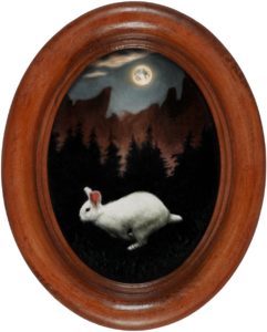
The White Rabbit
oil on aluminum
4 1/2″ x 3 1/4″

I’ve been following the white rabbit down the social media rabbit hole, and with every post, I’m growing out of my social media dread.

Until this past year, my social media presence was limited to a Facebook account with 5 posts, ever. But a lot has happened since then, and I’ve started a Facebook business page, this blog, an Instagram account and registered as a business on Yelp and  Google+. Most recently, I have even started a Newsletter to help friends, fans and fellow artists follow my Monthly Miniature rabbit paintings or get updates on my blog. Phew!

I love people, but putting myself out there on the internet was an emotional hurdle. As a social media novice, the first few posts were extremely difficult, and the “post/publish” button would fill me with dread and anxiety. But with time and practice, it has gotten MUCH easier. Reading other blogs has taught me that consistency makes a huge difference and I’m finding it’s not just for the typical reasons such as people looking for new content. Constancy also helps keep me on track and allows me to think about meeting my goals instead of thinking about my fears.

Now I actually feel pretty good when I get something up. Connecting with people in a real world kind of way is part of what I live for. The sharing is starting to feel much less like I’m exposing myself and more like I’m connecting, largely due to all the support that I’ve gotten from everyone out there. Heartfelt thanks to everyone looking, sharing and buying, and to everyone enjoying my newsletter. And special thanks to everyone commenting and leaving reviews. It lets me know I’m on the right track.

If you are a beginning blogger or artist, or you are thinking about starting a blog, my advice is to dive right in. Do the best you can this time, and then do it a little better next time. There is so much to know that you can’t learn it all ahead of time, and so much is just conquering your fear.