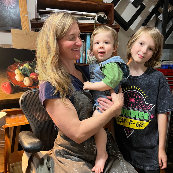
A Chance Meeting Leads to a Special Commission
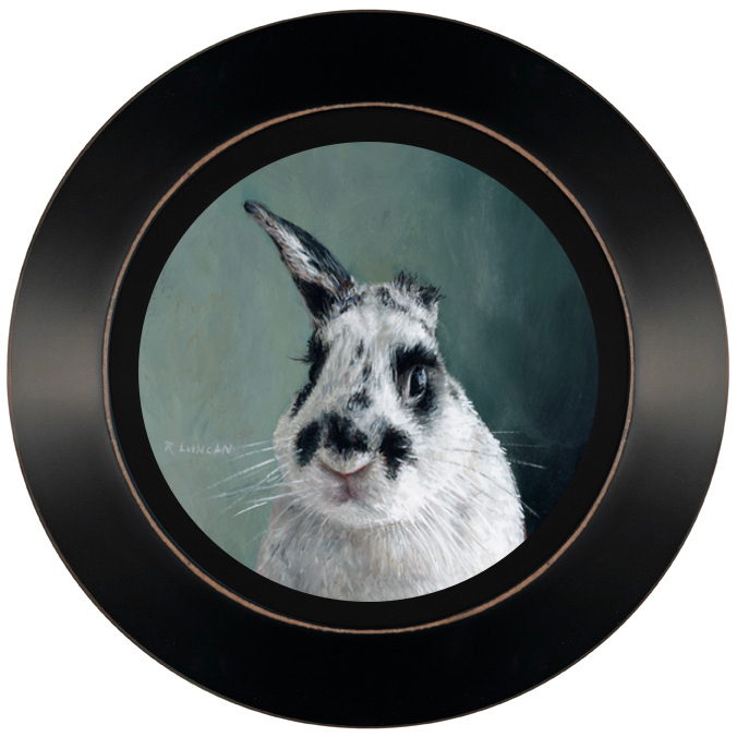
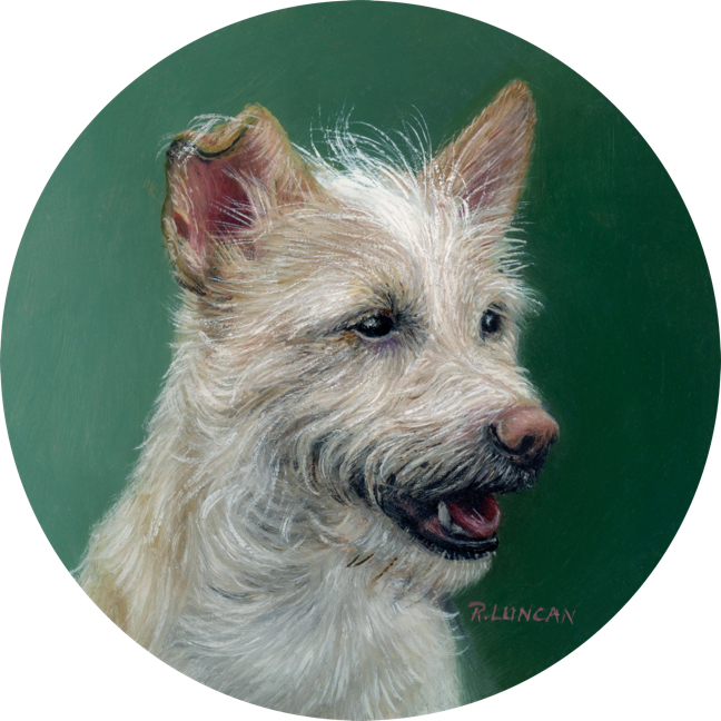
Rocky’s portrait began with a chance meeting at a dog park. Edrea met one of my clients there who happened to be walking Jefferson, who looked a lot like her Rocky. They got talking and once she was shown an image of Jefferson’s portrait, Edrea knew she wanted a portrait of her own chihuahua mix.
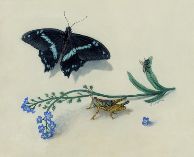
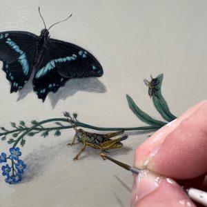
Rocky is an outdoorsy little dog with a big personality. Edrea shared a collection of wonderful reference photos. I created three mock-ups to explore different ideas: Rocky at the beach, on lush green grass, and with one of my signature Dutch-inspired formal backgrounds. The final choice was the Dutch portrait style, with a soft green tone that subtly echoed his outdoor adventures.
Framing the Finishing Touch
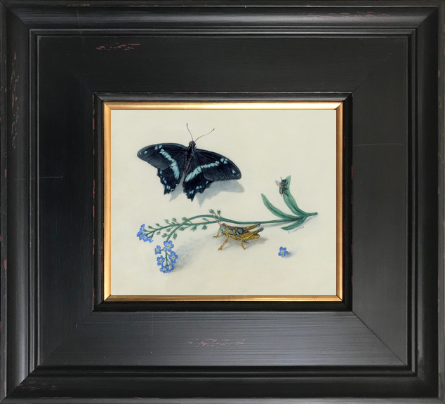
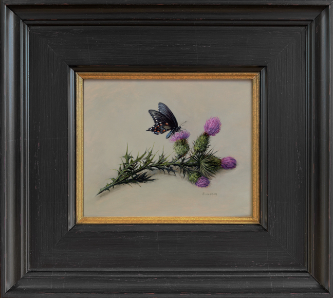
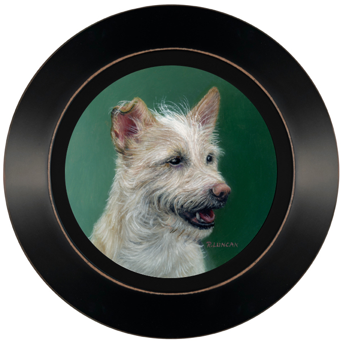
No painting feels complete to me without the right frame—something I learned firsthand while working as a professional picture framer throughout college. For Rocky, I used my favorite 1″ simple black frame, a style I’ve chosen for many of my miniature portraits. It’s understated yet elegant, and versitle, allowing the portrait itself to shine.
Framing isn’t just about aesthetics. It also marks the moment when a painting truly becomes a finished piece of art, ready to be displayed and cherished for years. In Rocky’s case, the black frame’s clean lines balance the softness of the painting, creating a perfect little jewel for the wall.
From Edrea:
Hi Rebecca! We just got the frame yesterday and it looks so, so wonderful! I can’t believe how detailed it is at that scale – it’s incredible!!
Thanks so much again for Rocky’s portrait – we love it so much.