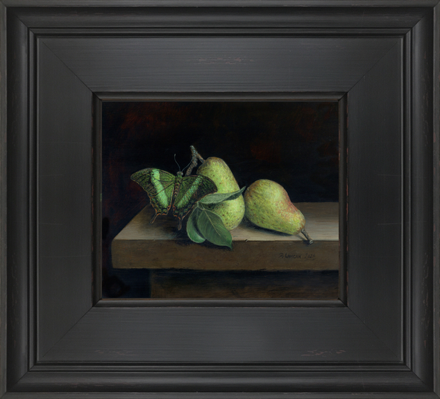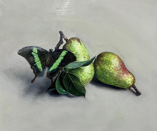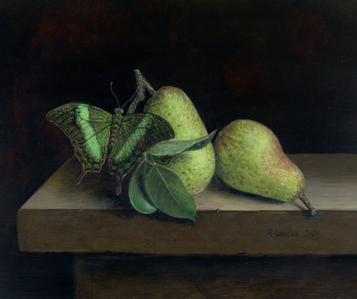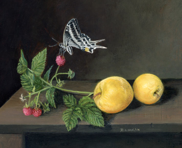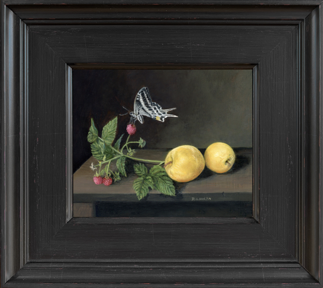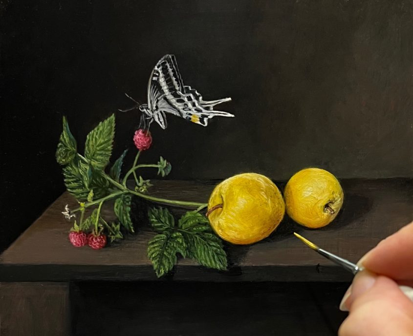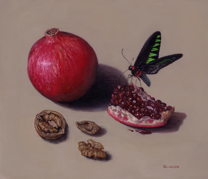
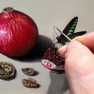
oil on copper, 4.5 x 5.5
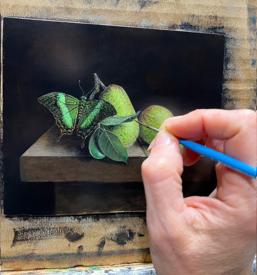
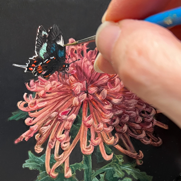
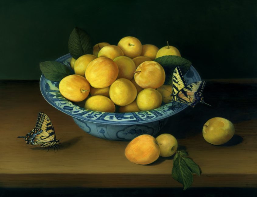
Making oil paintings is slow, thoughtful work. Before my brush ever touches a copper panel, the process involves weeks of gathering inspiration, researching, photographing references, creating digital mock-ups, and preparing my surface.
In an age of instant AI-generated artwork, I see the value in slowing down. Painters have faced similar upheavals since the invention of photography—and yet painting endures. I believe there’s a reason: nothing replaces the depth and intimacy of handmade art.
A Series Two Years in the Making
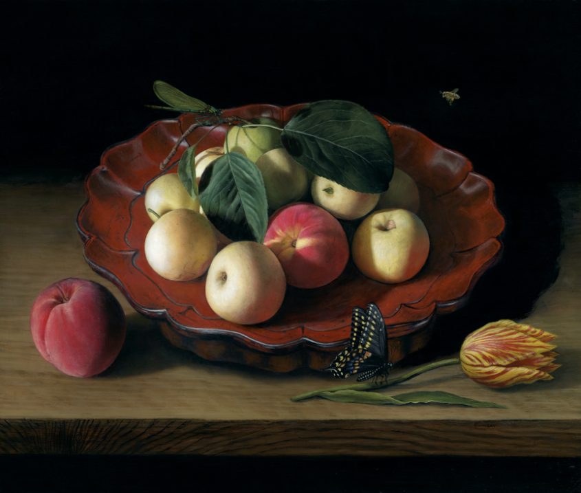
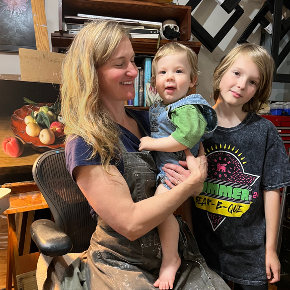
This month marks a milestone: the twelfth and final piece in my Swallowtail Butterfly Painting Series. Over the past two years, my “monthly” miniatures have been more “bi-monthly” miniatures as I navigate life with a new member of the family. Even with all the chaos of going through pregenancy and having a demanding infant I’m the primary caregiver for, I’ve somehow completed one painting after another, each pairing a swallowtail species with unique botanical elements. This final work celebrates not just the butterfly but the joy of slow, intentional living.
Slow Food, Slow Art
To highlight that theme, I included two of my favorite “slow foods”: pomegranates and walnuts. Sure, you can buy them prepped and packaged. But if you’ve ever cracked a walnut or dug out the seeds from a pomegranate, you know the quiet satisfaction that comes from doing it yourself.
The same can be said for painting. My work takes time—and that time adds flavor.
Featuring the Rajah Brooke’s Birdwing
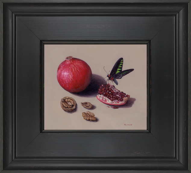
This painting features a male Rajah Brooke’s Birdwing butterfly, part of the Papilionidae family (which includes all swallowtails). These dazzling creatures are native to rainforests across Southeast Asia and have a wingspan of up to 6.5 inches. Their vivid green-and-black coloring makes them look like flying stained glass. In fact, they’re so large they’re often mistaken for birds—hence the name “birdwing.”
What Comes After the Swallowtails?
The past year brought big changes—especially having a one-year-old at home. Time for painting has been more limited, and I’ve learned to be gentle with myself and realistic with my goals.
So instead of monthly miniatures, my next project will ofically unfold as bi-monthly miniature paintings throughout 2025 and 2026. I’ve been deep in the planning stage—sketching, researching, and refining ideas—and I’m almost ready to begin.
Thank you for following along on this journey. I hope you’ll continue with me as the next series takes flight.