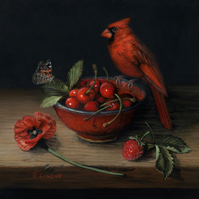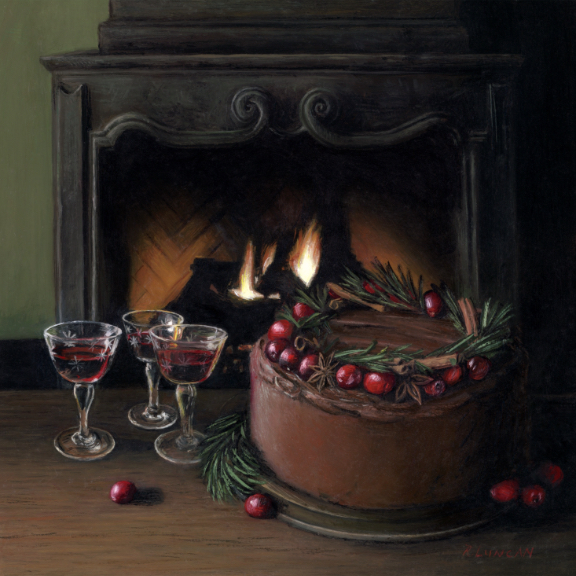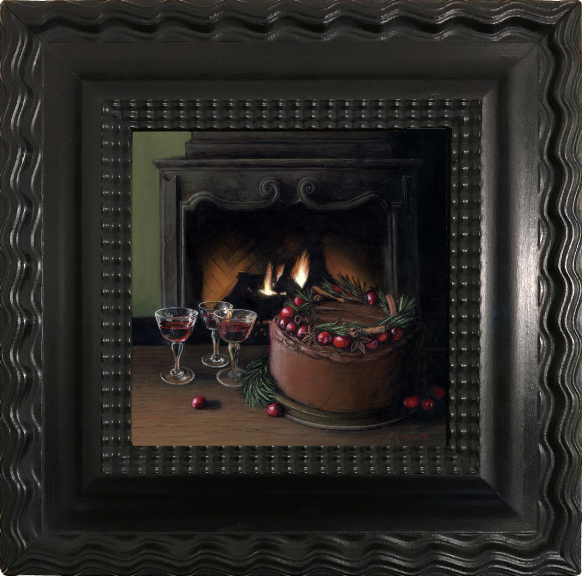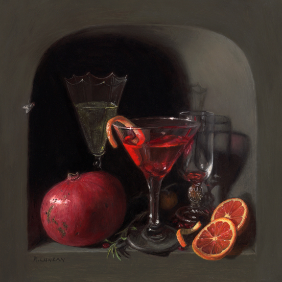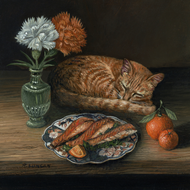
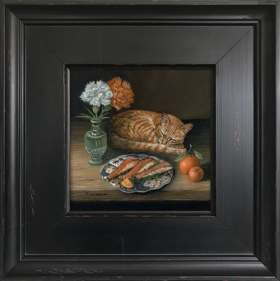
Feast in Orange, 5 x 5″, oil on aluminum
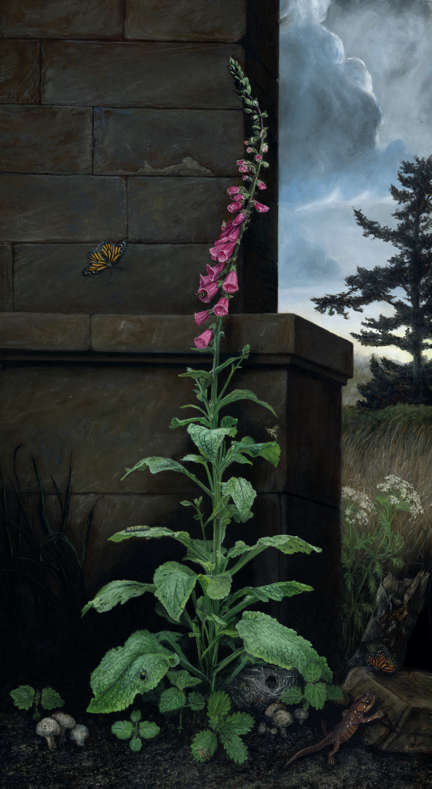
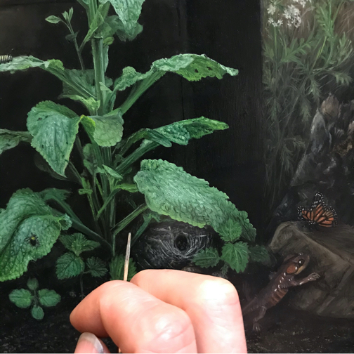
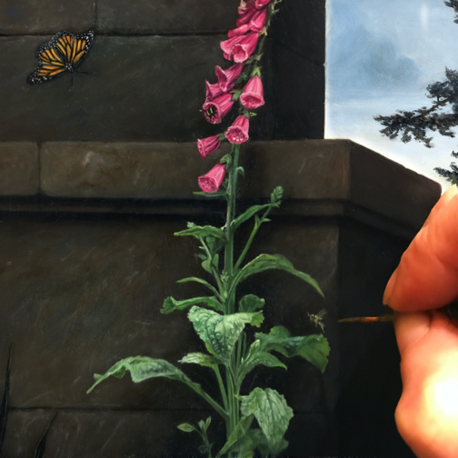
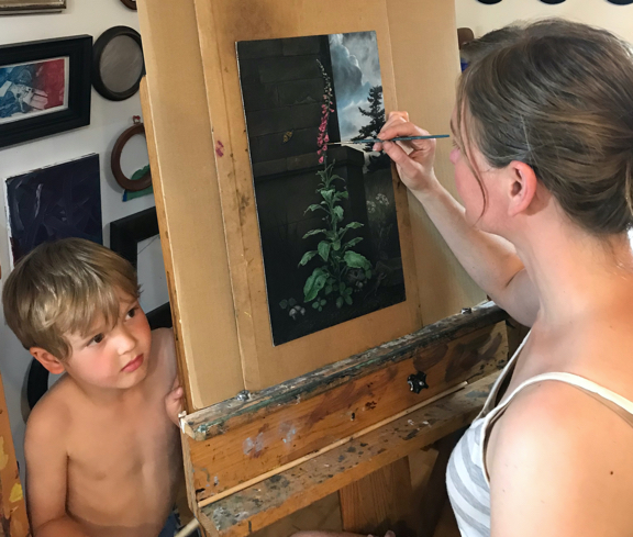
Chasing Color is an ongoing series of monthly miniature still life paintings that explores how a single hue can shape atmosphere, memory, and emotion. Each piece focuses on one dominant color, using classical techniques and a personal lens to build small, detailed scenes from fruits, florals, porcelain, and—sometimes—unexpected guests.
This month, I turned to orange: a color often tied to energy and brightness. But in Feast in Orange, I leaned into its softer side. The light is warm, the details are familiar, and the mood is quiet and calm.
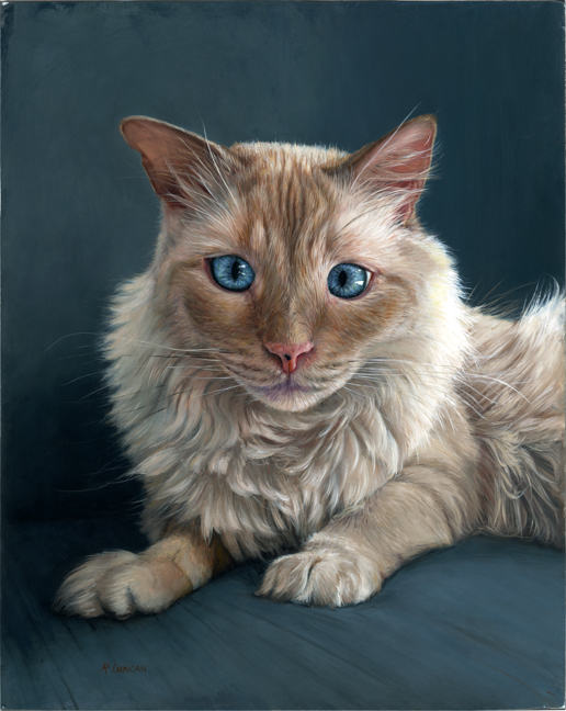
A Cat Among the Oranges
I don’t often include cats in my still life work, but this is the second time I’ve made an exception. The first was years ago—a curious feline peeking onto a table, much in the manner of Clara Peters. In this new piece, I originally sketched the cat awake, but he had such a strong presence that the painting began to feel more like a pet portrait with still life elements than the other way around. Once I tried the composition again with the cat sleeping, everything shifted. His presence became subtler, and the overall balance felt right. The still life returned to center stage.

Of course, I doubt any cat would actually sleep through the smell of fresh salmon. But he’s good at pretending—as long as he’s being watched.
Creature Comforts Revisited
Looking back, I realize this painting echoes a mindset I had during an earlier series made at the height of the pandemic. That body of work, called Creature Comforts, was all about finding reassurance in simple things: a nourishing meal, a soft flower, a warm cup in hand. Without planning it, I seem to have returned to that space here. The navel orange, the mandarin, the fillets of salmon laid out on a porcelain room plate—they speak to comfort. The ruffled carnations in a green glass vase, the napping cat, the hush of the composition—they speak to peace.
Sometimes we don’t know they why’s of what we’re painting until we’re finished.
A Personal Note
This piece took longer to share than usual. It had been finished for weeks but sat quietly in the studio while we traveled back to the Midwest to visit family. My mom was recently diagnosed with pancreatic cancer. Thankfully, they caught it early, and she’s a fighter. As soon as school let out for the summer, we packed up and flew out to Ohio.
It was a deeply meaningful trip. Most of my family is still in the area, and being able to spend real time together—especially after a quick visit earlier this spring with just the baby—made the experience even more memorable.
Painting has always helped me process things I don’t yet have words for. And while I didn’t see the connection at first, Feast in Orange became a reflection of what I needed that time. A longing for closeness. A need for calm. A kind of emotional nourishment.
Thank you, as always, for following along with my work and my story.