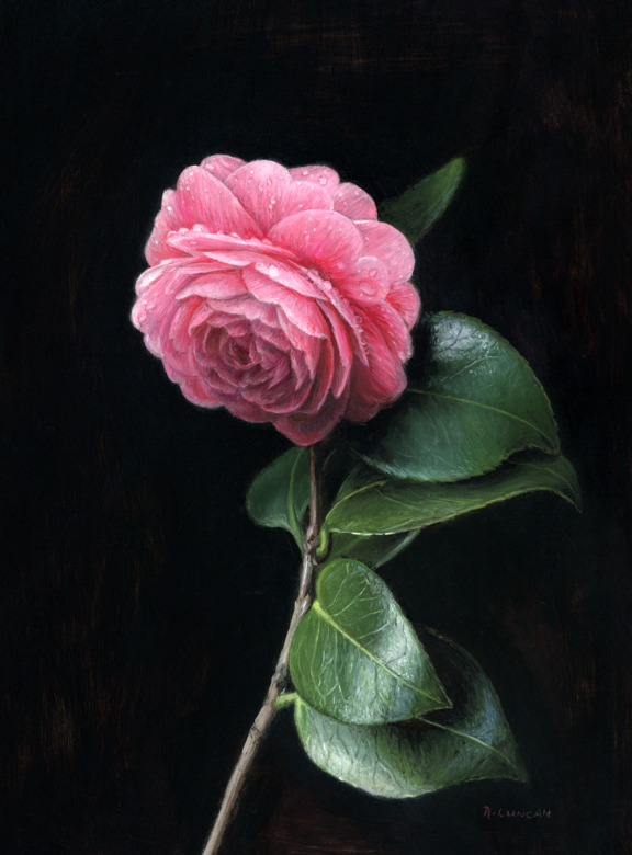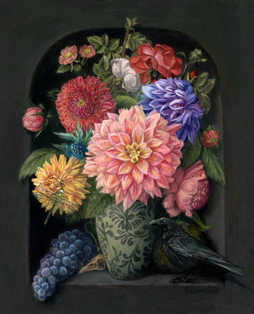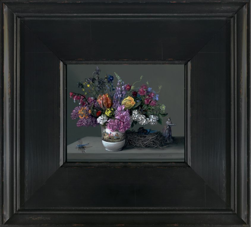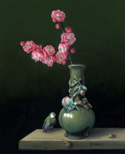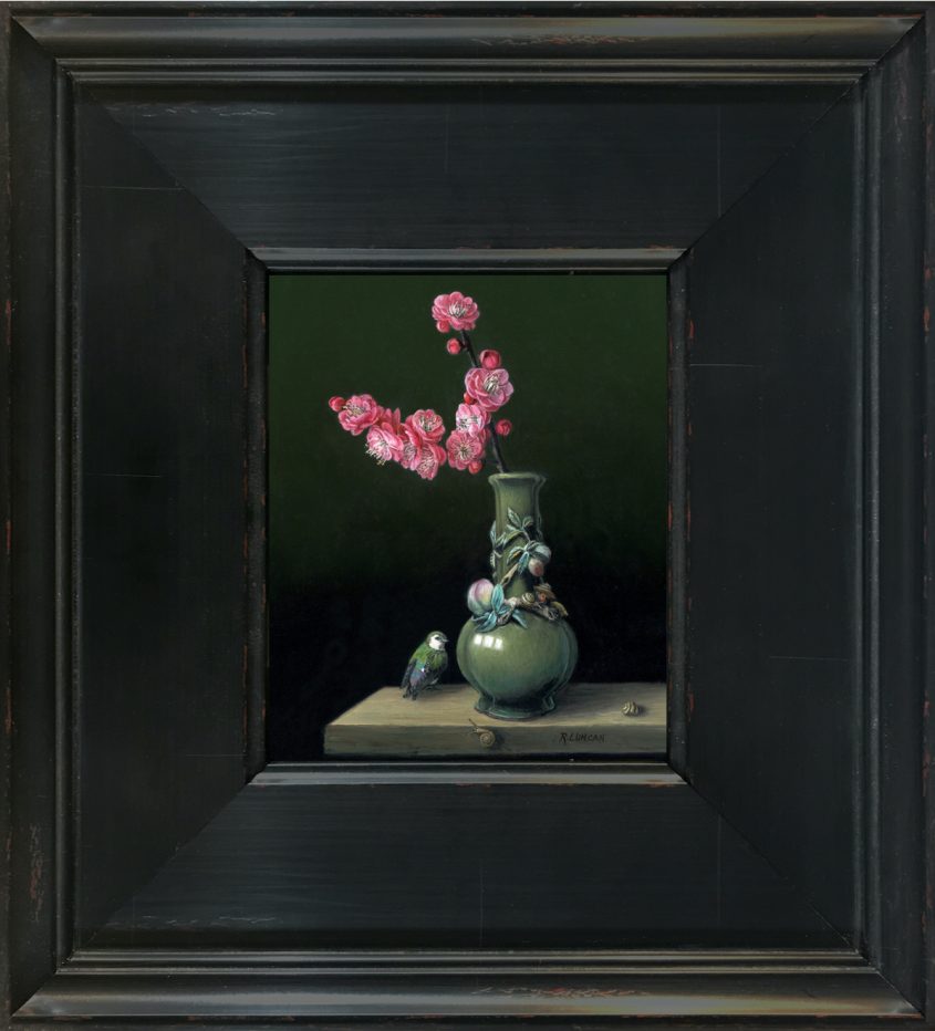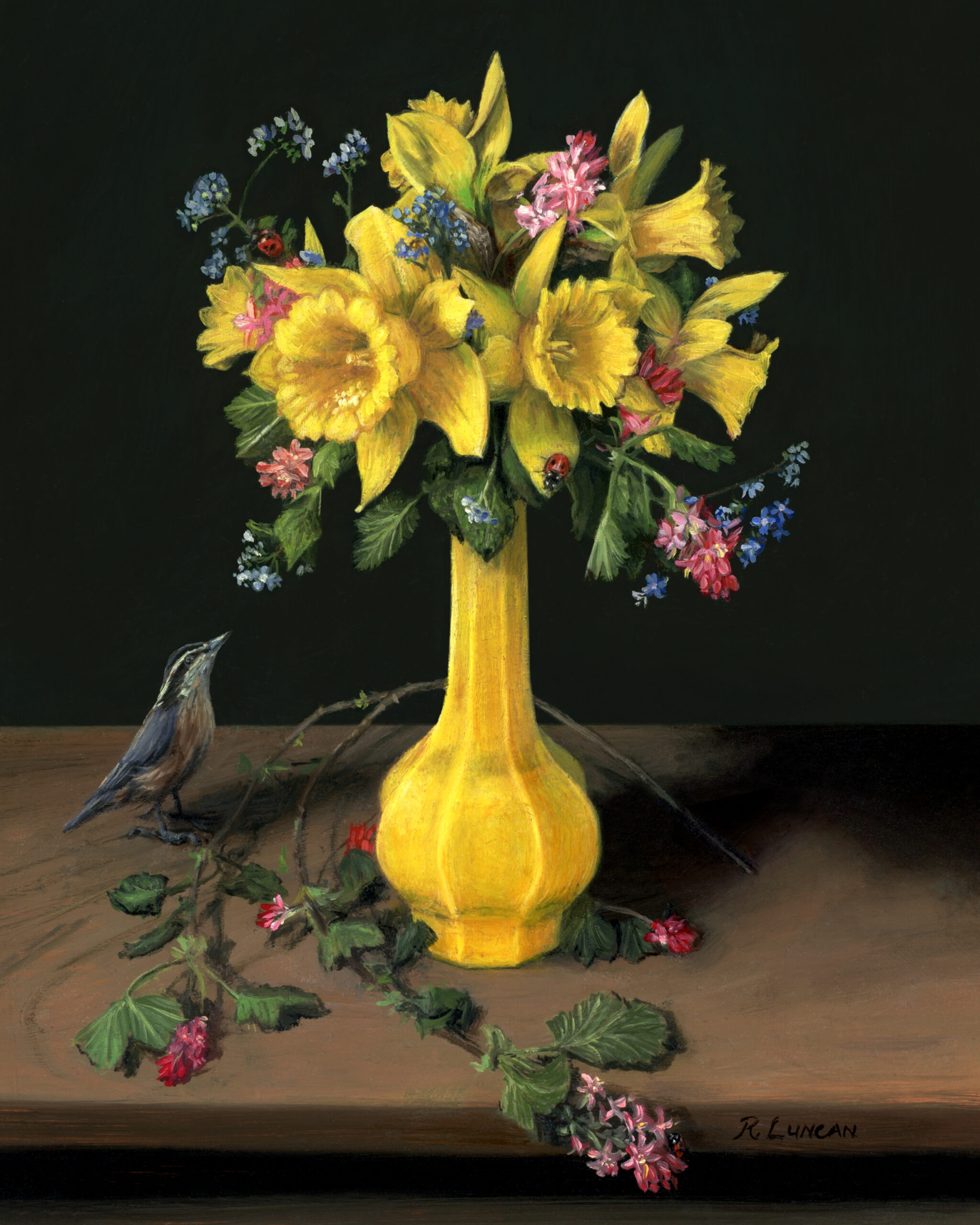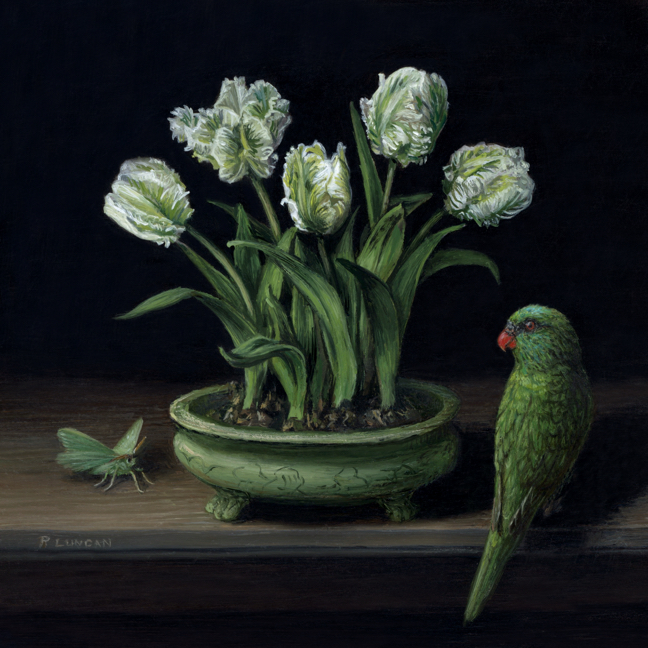
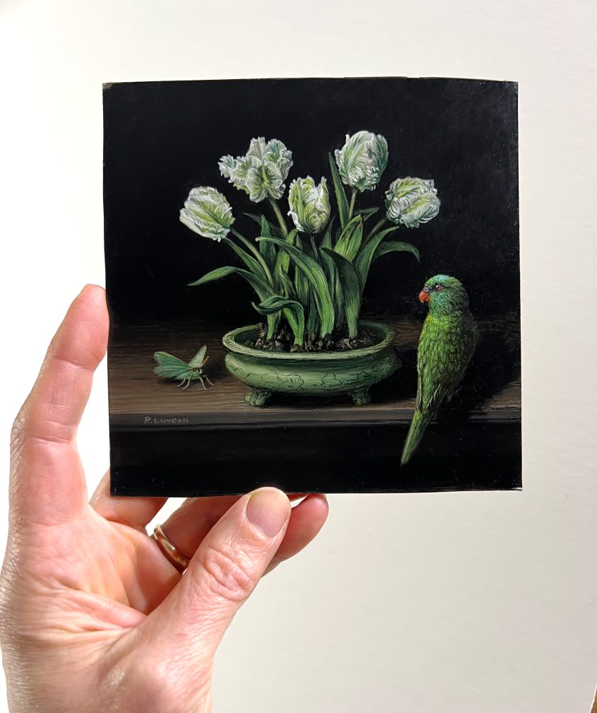
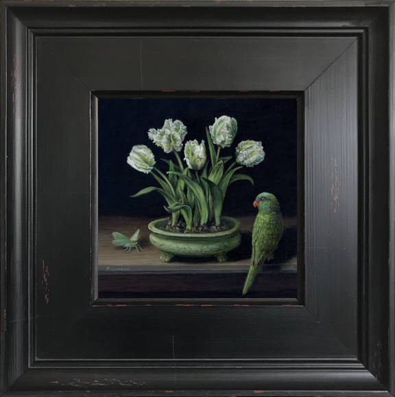
Druing the month of November, I usually find myself painting comfort foods. But this new painting in my “Chasing Color” monthly miniature series moved in a different direction. Instead of I built a composition centered on living forms: parrot tulips with their bulbs intact, a scaly-breasted lorikeet perched at the table’s edge, and a resting emerald moth.
Green became the thread that held everything together. It moves through the painting in shifting tones, from the cool celadon of the vessel and the jade-like surface of the moth to the yellow-green veins running through the tulip petals. Even within a single flower, the color expands and contracts, never settling into one hue. The result is a still life that feels active and atmospheric at the same time, suspended between motion and stillness.
Tulips, Memory, and Celadon
The tulips form the center of the composition. I have grown many varieties in my garden, but parrot tulips remain a favorite for their movement and irregularity. Leaving the bulbs attached was important to me. It keeps them connected to their origin, suggesting growth rather than arrangement, and lends a sense of quiet persistence beneath the surface.
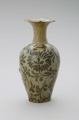
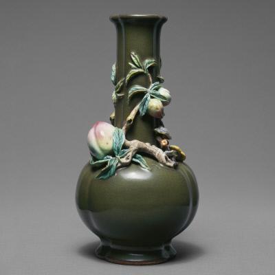
The vessel is inspired by a celadon tripod incense burner, a form associated with Chinese ceramics of the Ming dynasty. I was first drawn to celadon years ago while working on an installation at the Seattle Asian Art Museum. A small exhibition paired celadon vessels with intricately carved jade objects, and I remember being struck by the way the glaze seemed to hold light within it. That impression stayed with me and returned as I developed this painting.
The lorikeet carries a more personal association. Its posture and coloring recall a parrot from my childhood, a vivid presence that brought both energy and watchfulness into the home. Here, it becomes part of the quiet exchange between objects, aware and observant.
Process, Time, and Return
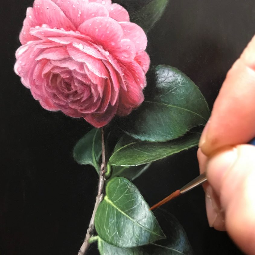
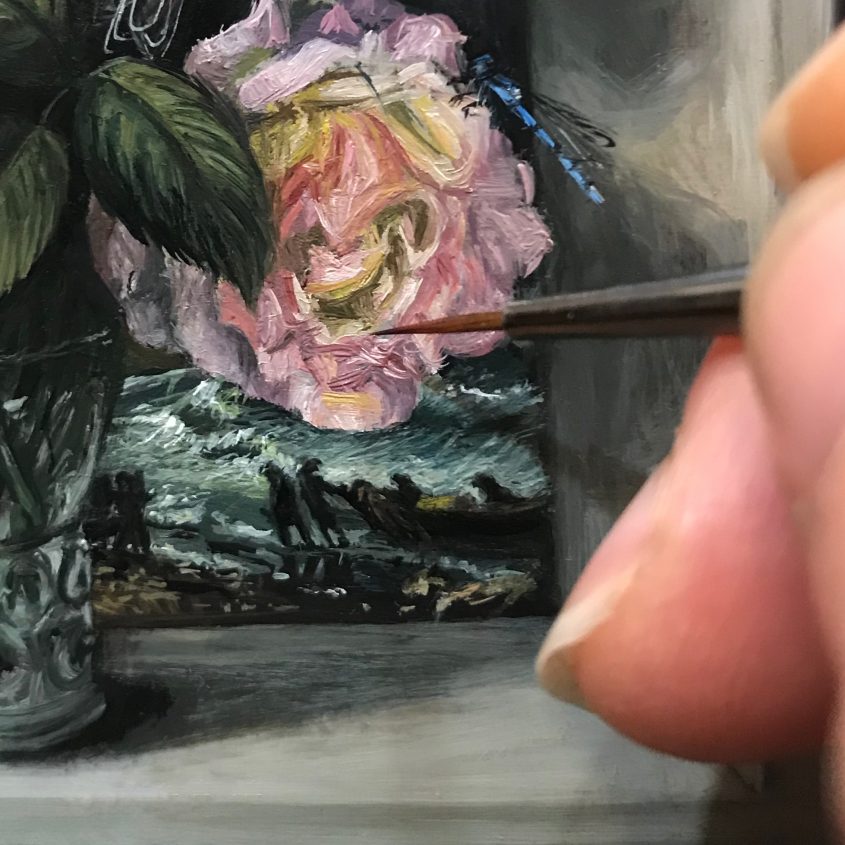
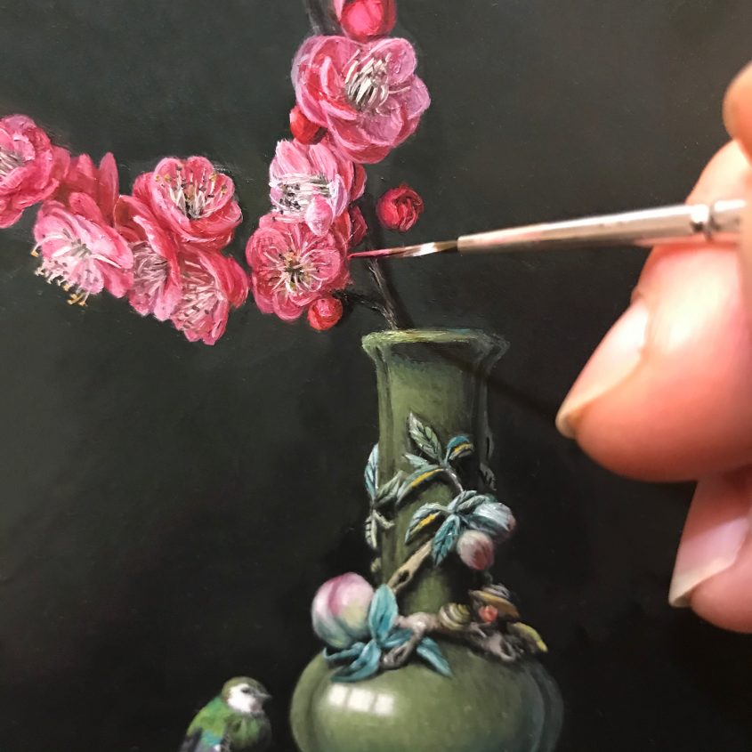
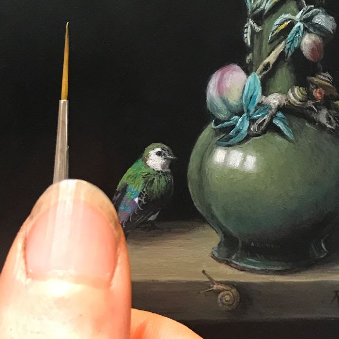
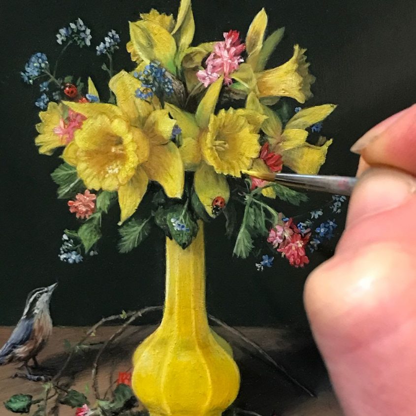
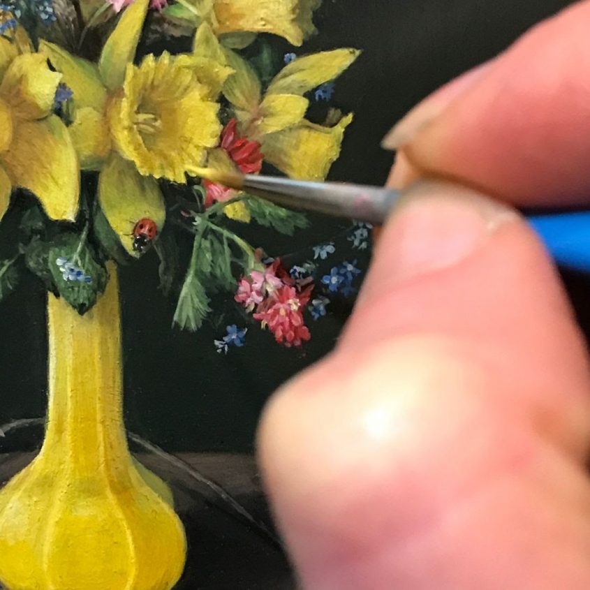
This painting came together gradually, shaped in intervals of concentrated work. Recent months have required a more flexible approach to studio time, working in shorter stretches and returning to the surface again and again. In some ways, that rhythm mirrors the painting itself, layered, responsive, and built through accumulation rather than a single sustained effort.
Parrot Tulips in Celadon is a 5 by 5 inch oil painting on aluminum and part of the ongoing Chasing Color series. Each piece in the series explores a single dominant hue as a way of studying mood, structure, and perception.
Green, in this case, became something more than a color. It offered a way to hold together ideas of growth, memory, and renewal, especially in a season that leans toward reflection.
Receive a preview of each new Monthly Miniature in your inbox – subscribe now